The Institute for Health Metrics and Evaluation (IHME) works with collaborators around the world to develop timely, relevant, and scientifically valid evidence that illuminates the state of health everywhere.
The Global Burden of Disease (GBD) study, conducted by the Institute for Health Metrics and Evaluation (IHME), evaluates mortality and disability caused by 371 diseases and injuries, along with 88 risk factors across the globe. IHME meticulously collects and analyzes the data, offering insights into trends over time, the effectiveness of interventions, and disparities in the impact of malaria among different populations. The IHME provides extensive malaria data that includes prevalence, incidence, mortality rates, intervention coverage, and the overall burden of disease in 204 countries and territories, with subnational estimates for 21 regions. This comprehensive dataset is a valuable resource for policymakers, researchers, and public health professionals in developing strategies to reduce the global malaria burden and monitor progress toward elimination goals.
Accessing the data
The GBD Results Tool enables you to download estimates from the study, along with relevant materials such as survey instruments, protocols, and summary information, are accessible on the IHME Data Page through the Global Health Data Exchange (GHDx). You can search for datasets directly or use the GDB Results Tool for more detailed queries. IHME also offers API access to interact with large datasets programmatically.
Search terms such as "IHME malaria deaths estimates", "malaria prevalence", "malaria incidence", or "bednet usage" can be used to find datasets compiled by IHME related to malaria on the GHDx homepage.
Alternatively, you can navigate to the Data Tools tab on the homepage. However, you will need to create an account or sign in to access and download data. If you do not have an account, click on sign in at the top of the Results tab. If you already have an account, click sign in and enter your credentials, then select GBD results tool under IHME Data Visualization Tools. In the results tool interface, select the choose the disease metrics and apply filters to narrow the search by location (country/region), year, age group, and sex.
IHME GBD Results Visualization Tool Page.
You can also visualize data as graphs or tables before downloading. You can right-click on the title of files within the GHDx and download them. Datasets can be downloaded as .csv and .xls files from the GHDx site.
What does the data look like?
The data can be downloaded from the GHDx IHME ITN Data Page as a .xls file. This dataset provides estimates of bed net ownership, ownership among populations at risk, bed net use in children under five in at-risk populations, and trends in the scale-up of LLIN in 44 African countries during the 1999 to 2008 period.
IHME estimates of insecticide treated bednets distributed.
Datasets dowloaded as .csv files from the GDB Results Tool have a standard format which contains mortality, prevalence and incidence in number, percent and rate by location, sex, age, cause of injury, annual value as well as the upper and lower bounds.
IHME estimates of malaria related deaths, prevalence and incidence.
Key points to consider
IHME (Institute for Health Metrics and Evaluation) provides detailed data on health metrics, including estimates of disease burden such as incidence, mortality, and risk factors for malaria, which can inform transmission models. When integrating IHME data estimates into malaria transmission models, several key aspects should be considered regarding data collection, storage, and its usage to ensure accurate and effective modeling.
IHME uses statistical models and expert review to produce comprehensive Global Burden of Disease (GBD) estimates of malaria burden by country, age, and sex.
Data is updated annually or periodically depending on the source (e.g., monthly surveillance data or annual surveys).
These data might not always have the same resolution as the model. For instance, while a model may require fine-grained data at the village level or daily intervals, IHME may provide data aggregated at the national level or annually.
IHME estimates often come with uncertainty intervals due to limitations in the data sources. This uncertainty should be accounted for in model simulations, especially for stochastic models or sensitivity analyses.
How to use this data?
These datasets can be explored to gain insights into the ownership of ITNs, distribution of LLINs, and assess the impact of malaria in Elimination 8 (E8) countries during the 2000 to 2008 period.
Inspect the data beforehand to understand how it is structured and identify indicators that are relevant to our analysis, we can display our data in a table as follows:
Show the code
library(readxl)library(tidyverse)# Load insecticide treated nets dataihme_nets <-read_excel(path ="data/IHME_INSECTICIDE_TREATED_BEDNETS_SUB_SAHARAN_AFRICA_1999_2008.xls")# Pull the names of countriesihme_nets |>pull(Country) |>unique()
The E8 countries are Angola, Botswana, Eswatini, Mozambique, Namibia, South Africa, Zambia and Zimbabwe. To filter the data for these countries, you can use the following code to display our data in a table as follows:
[1] "Republic of Angola"       "Republic of South Africa"
[3] "Kingdom of Eswatini"      "Republic of Zambia"
[5] "Republic of Zimbabwe"     "Republic of Mozambique"
[7] "Republic of Botswana"     "Republic of Namibia"
We can look at the data to identify indicators to use for analysis:
Show the code
library(gt)observed_cases |>filter(location_name =="Republic of South Africa") |>head() |>gt()
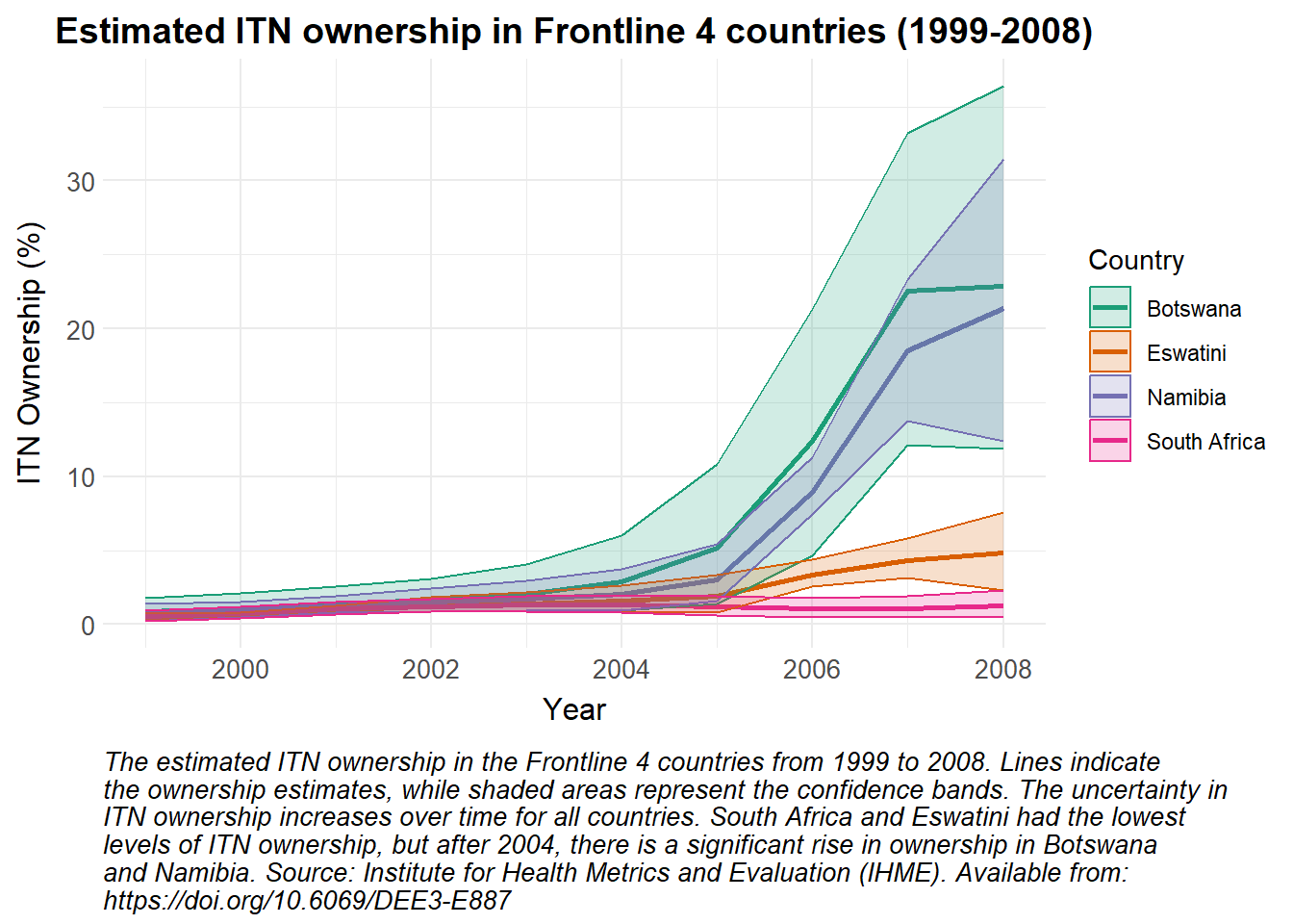
As these data are estimated and lower and upper bounds are provided, a line plot is used to show the change in estimated ITN ownership over time, with ribbons representing the confidence intervals.
Show the code
# Modify the Country names to replace "Swaziland" with "Eswatini"ihme_nets |>mutate(Country =ifelse(Country =="Swaziland", "Eswatini", Country)) |># Filter the data for Frontline 4 countriesfilter(Country %in%c("Namibia", "South Africa", "Eswatini", "Botswana")) |># Create a ggplot object with the filtered dataggplot(aes(x = Year, y =`% ITN Ownership`, color = Country)) +# Add lines to the plot, coloured by Countrygeom_line(linewidth =1) +# Add ribbons to the plot to represent the confidence intervals, filled by countrygeom_ribbon(aes(ymin =`% ITN Ownership Lower Bound`, ymax =`% ITN Ownership Upper Bound`, fill = Country), alpha =0.2) +# Apply custom colour scale for linesscale_colour_manual_health_radar() +# Apply custom fill scale for ribbonsscale_fill_manual_health_radar() +# Apply custom themetheme_health_radar() +# Add labels and title to the plotlabs(title ="Estimated ITN ownership in Frontline 4 countries (1999-2008)",x ="Year",y ="ITN Ownership (%)",color ="Country",fill ="Country", caption =str_wrap("The estimated ITN ownership in the Frontline 4 countries from 1999 to 2008. Lines indicate the ownership estimates, while shaded areas represent the confidence bands. The uncertainty in ITN ownership increases over time for all countries. South Africa and Eswatini had the lowest levels of ITN ownership, but after 2004, there is a significant rise in ownership in Botswana and Namibia. Source: Institute for Health Metrics and Evaluation (IHME). Available from: https://doi.org/10.6069/DEE3-E887", width =100))
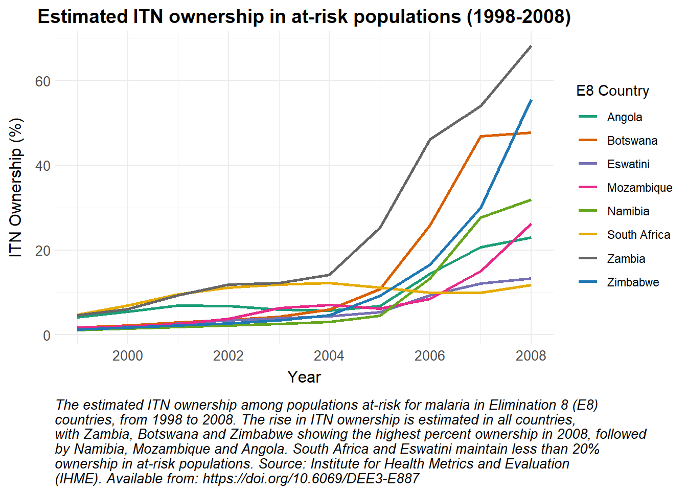
No bounds are provided for estimated ITN ownership in at-risk populations, so a simple line graph is used to represent these data.
Show the code
# Modify the Country names to replace "Swaziland" with "Eswatini"ihme_nets |>mutate(Country =ifelse(Country =="Swaziland", "Eswatini", Country)) |># Filter the data for E8 countriesfilter(Country %in% e8_countries) |># Create a ggplot object with the filtered dataggplot(aes(x = Year, y =`% ITN Ownership Pop. At Risk`, color = Country)) +# Add lines to the plot, coloured by Countrygeom_line(linewidth =1) +# Apply custom colour scalescale_colour_manual_health_radar() +# Apply custom themetheme_health_radar() +# Add labels and title to the plotlabs(title ="Estimated ITN ownership in at-risk populations (1998-2008)",x ="Year",y ="ITN Ownership (%)",colour ="E8 Country",caption =str_wrap("The estimated ITN ownership among populations at-risk for malaria in Elimination 8 (E8) countries, from 1998 to 2008. The rise in ITN ownership is estimated in all countries, with Zambia, Botswana and Zimbabwe showing the highest percent ownership in 2008, followed by Namibia, Mozambique and Angola. South Africa and Eswatini maintain less than 20% ownership in at-risk populations. Source: Institute for Health Metrics and Evaluation (IHME). Available from: https://doi.org/10.6069/DEE3-E887", width =90))
The ‘observed_cases’ data can be accessed as follows:
[1] "Republic of Angola"       "Republic of South Africa"
[3] "Kingdom of Eswatini"      "Republic of Zambia"
[5] "Republic of Zimbabwe"     "Republic of Mozambique"
[7] "Republic of Botswana"     "Republic of Namibia"
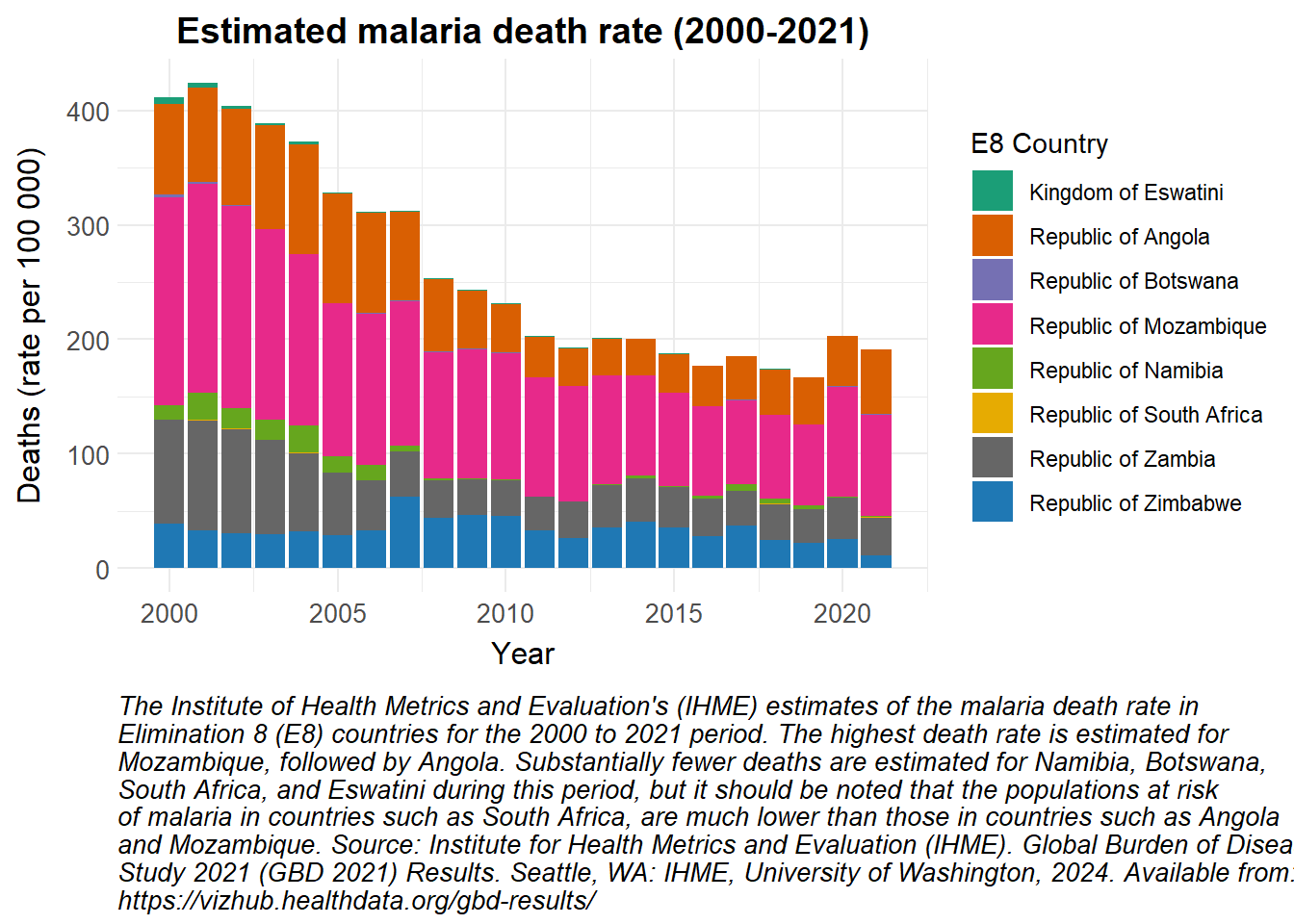
A stacked bar plot has been used to show the estimated number of malaria deaths in the E8 countries from 2000 to 2021.
Show the code
# Convert the observed_cases data to a data frameobserved_cases |>as.data.frame() |># Filter the data for deaths and rate metricsfilter(measure_name =="Deaths", metric_name =="Rate") |># Group the data by locationgroup_by(location_name) |># Create a ggplot object with the filtered and grouped dataggplot() +# Add stacked bar plots to the chart, filled based on locationgeom_bar(aes(x = year, y = val, fill = location_name), stat ="identity", position ="stack") +# Apply custom fill colour scalescale_fill_manual_health_radar() +# Apply custom themetheme_health_radar() +# Add labels and title to the plotlabs(title ="Estimated malaria death rate (2000-2021)",x ="Year",y ="Deaths (rate per 100 000)",fill ="E8 Country",caption =str_wrap("The Institute of Health Metrics and Evaluation's (IHME) estimates of the malaria death rate in Elimination 8 (E8) countries for the 2000 to 2021 period. The highest death rate is estimated for Mozambique, followed by Angola. Substantially fewer deaths are estimated for Namibia, Botswana, South Africa, and Eswatini during this period, but it should be noted that the populations at risk of malaria in countries such as South Africa, are much lower than those in countries such as Angola and Mozambique. Source: Institute for Health Metrics and Evaluation (IHME). Global Burden of Disease Study 2021 (GBD 2021) Results. Seattle, WA: IHME, University of Washington, 2024. Available from: https://vizhub.healthdata.org/gbd-results/", width =100))
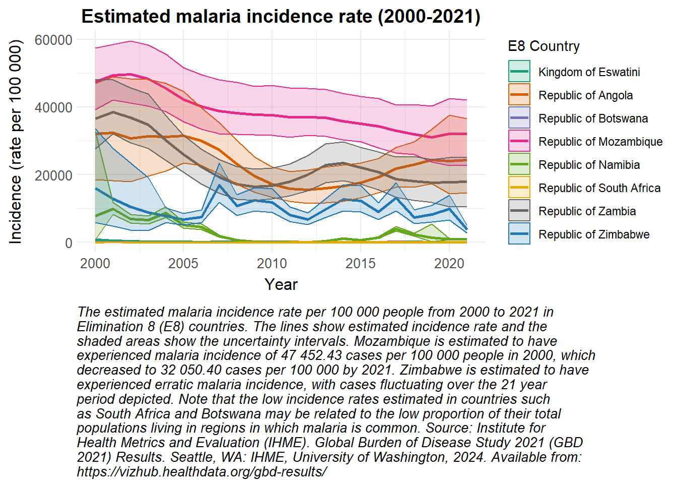
Upper and lower bounds were again available for the estimated malaria incidence rate, so a line plot with ribbons was chosen to visualise these data.
Show the code
# Convert the observed_cases data to a data frameobserved_cases |>as.data.frame() |># Filter the data for incidence and rate metricsfilter(measure_name =="Incidence", metric_name =="Rate") |># Create a ggplot object with the filtered dataggplot(aes(x = year, y = val, color = location_name)) +# Add lines to the plot, coloured by location namegeom_line(linewidth =1) +# Add ribbons to the plot to represent the confidence intervals, filled based on locationgeom_ribbon(aes(ymin = lower, ymax = upper, fill = location_name), alpha =0.2) +# Apply custom colour scale for linesscale_colour_manual_health_radar() +# Apply custom fill scale for ribbonsscale_fill_manual_health_radar() +# Apply custom themetheme_health_radar() +# Add labels and title to the plotlabs(title ="Estimated malaria incidence rate (2000-2021)",x ="Year",y ="Incidence (rate per 100 000)",colour ="E8 Country",fill ="E8 Country", caption =str_wrap("The estimated malaria incidence rate per 100 000 people from 2000 to 2021 in Elimination 8 (E8) countries. The lines show estimated incidence rate and the shaded areas show the uncertainty intervals. Mozambique is estimated to have experienced malaria incidence of 47 452.43 cases per 100 000 people in 2000, which decreased to 32 050.40 cases per 100 000 by 2021. Zimbabwe is estimated to have experienced erratic malaria incidence, with cases fluctuating over the 21 year period depicted. Note that the low incidence rates estimated in countries such as South Africa and Botswana may be related to the low proportion of their total populations living in regions in which malaria is common. Source: Institute for Health Metrics and Evaluation (IHME). Global Burden of Disease Study 2021 (GBD 2021) Results. Seattle, WA: IHME, University of Washington, 2024. Available from: https://vizhub.healthdata.org/gbd-results/", width =85))
How can this data be used in disease modelling?
The Global Burden of Disease (GBD) data on historical trends in on various disease metrics can serve to validate the accuracy of predictions made by transmission models. Malaria models frequently require calibration to align with IHME-derived estimates, such as adjusting transmission rates based on observed incidence or prevalence.
Preparing the data
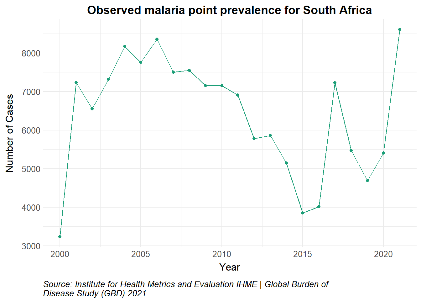
The Global Burden of Disease study has produced estimates of prevalence for malaria worldwide. Prevalence is defined as the total number of cases of a given cause in a specified population at a designated time. It is differentiated from incidence, which refers to the number of new cases in the population at a given time. Observations from Plasmodium falciparum parasite rate (PfPR) surveys and national routine surveillance systems of confirmed and unconfirmed diagnoses are augumented into a model of disease burden. More information on this methodology is provided here.
Show the code
# Load data from GBDobserved_df <-read_csv("data/IHME-GBD_2021_DATA-05f6b66f-1.csv", show_col_types =FALSE) |>as.data.frame() |>filter(measure_name =="Prevalence", metric_name =="Number", location_name =="Republic of South Africa") |>rename(value = val)observed_df |>ggplot() +geom_point(aes(x = year, y = value, colour = measure_name)) +geom_line(aes(x = year, y = value, colour = measure_name)) +scale_colour_manual_health_radar() +theme_health_radar() +labs(title ="Observed malaria point prevalence for South Africa",x ="Year",y ="Number of Cases",caption =str_wrap("Source: Institute for Health Metrics and Evaluation IHME | Global Burden of Disease Study (GBD) 2021.")) +guides(colour ="none")
Modeling prevalence
A good use of prevalence data is to calibrate transmission models. This is particularly useful if incidence data is limited, and in diseases with a significant asymptomatic proportion of the population, such as malaria. Fitting the model to both incidence and prevalence data provides a more complete picture of disease dynamics.
Point prevalence data is obtained from cross-sectional surveys. As such, we may fail to capture dynamic trends in transmission and malaria immunity. In addition, capturing the asymptomatic population (as a proportion of total prevalence) depends on the sensitivity of the diagnostic tool used.
Malaria models set in endemic countries also assume that humans can be exposed to and infected by an infectious mosquito while recovering from an initial infection (secondary infection). It may be difficult to estimate the true proportion of the population that has recovered from an initial infection already, and is now susceptible to a secondary infection.
Model calibration
To calibrate the model, firstly, build a transmission model that reflects the underlying health system dynamics in the country, coverage levels for any control interventions deployed, as well as relevant mosquito, parasite and human behaviours. We then select key parameters to fine-tune, causing the model output to better mimic the observed data.
We minimise the difference between the model output and observed data using sum of least squares or maximum likelihood estimation. An example of this function is shown in the code snippet below, and a simulated plot thereafter.
Show the code
#|eval: false#|echo: true#|warning: false# Objective or cost functionobjective_function <-function(initial_parameters, observed_df) {# Parameters to fine tune a <- initial_parameters[1] # human biting rate pa <- initial_parameters[2] # probability of asymptomatic infection irs_eff <- initial_parameters[3] # effectiveness of IRS at reducing transmission delta <- initial_parameters[4] # natural recovery rate r <- initial_parameters[5] # rate of loss of infectiousness# Run the ODE model output_df <-ode(y = initial_state, times = times, func = seacr, parms = initial_parameters,irs_cov = irs_cov)# Calculate the values for prevalence prev_df <- output_df |>as.data.frame() |>mutate(Prv =c(0, diff(CPrv))) |>pivot_longer(!time, names_to ="state", values_to ="value") |>mutate(year =1995+ceiling(time/365)) |>filter(state %in%"Prv") |>group_by(year) |>slice_tail(n =1) |>filter(year >=2000) # adjust timeframe to match data# Actual GBD data observed_prev <-filter(observed_df, measure_name =="Prevalence")$value# Model projections predicted_prev <- prev_df$value# Calculate distance using sum of least squares or Poisson log- likelihood error <- (observed_prev - predicted_prev)^2#error <- dpois(round(observed_prev, 0), predicted_prev, log = TRUE) total <-sum(error)return(-total)}# Run optimization to mimimise totaloptim_result <-optim(par = initial_parameters, fn = objective_function, observed_df = observed_df, method ="L-BFGS-B",lower =c(a =0.1, rho =1/500, pa =0.01, delta =1/280, irs_eff =0.1, r =1/21),upper =c(a =0.9, rho =1/40, pa =0.9, delta =1/90, irs_eff =0.9, r =1/3) )# Best-fit parameters from calibrationcal_parameters <- optim_result$par# Run model with new calibrated parameters calibrated_output <-ode(y = initial_state, times = times, func = seacr, parms = cal_parameters,irs_cov = irs_cov)# Plot prevalence of new model fit with ggplot
Show the code
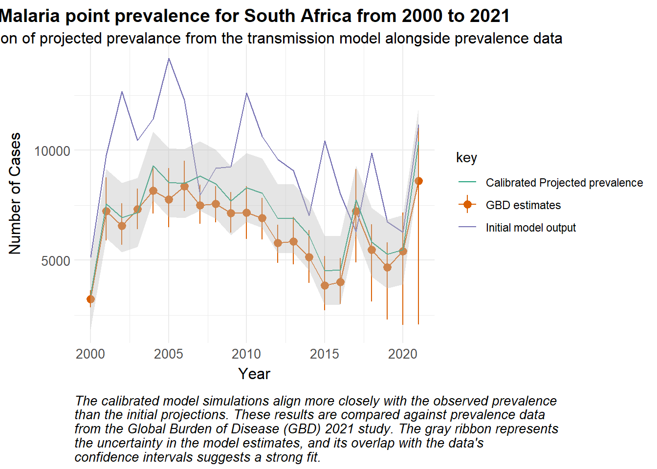
set.seed(123)# Simulated valuespredicted_prev <-data.frame(year =2000:2021,value = observed_df$value +rnorm(length(observed_df$value), mean =3000, sd =2000)) |>mutate(key ="Initial model output") |>bind_rows(data.frame(year =2000:2021,value = observed_df$value +rnorm(length(observed_df$value), mean =700, sd =500)) |>mutate(std_error =800, # for examplelower = value - (1.96* std_error),upper = value + (1.96* std_error),key ="Calibrated Projected prevalence") )merged_df <-bind_rows( predicted_prev,mutate(observed_df, key ="GBD estimates") ) ggplot() +geom_line(data =filter(merged_df, key =="GBD estimates"), aes(x = year, y = value, colour = key)) +geom_pointrange(data =filter(merged_df, key =="GBD estimates"), aes(x = year, y = value, ymin = lower, ymax = upper, colour = key)) +geom_line(data =filter(merged_df, key =="Initial model output"), aes(x = year, y = value, colour = key)) +geom_line(data =filter(merged_df, key =="Calibrated Projected prevalence"), aes(x = year, y = value, colour = key)) +geom_ribbon(data =filter(merged_df, key =="Calibrated Projected prevalence"), aes(x = year, y = value, ymin = lower, ymax = upper), fill ="grey", alpha =0.4) +scale_colour_manual_health_radar() +theme_health_radar() +labs(title ="Malaria point prevalence for South Africa from 2000 to 2021",subtitle ="Simulation of projected prevalance from the transmission model alongside prevalence data",x ="Year",y ="Number of Cases",Colour ="Variable",caption =str_wrap("The calibrated model simulations align more closely with the observed prevalence than the initial projections. These results are compared against prevalence data from the Global Burden of Disease (GBD) 2021 study. The gray ribbon represents the uncertainty in the model estimates, and its overlap with the data's confidence intervals suggests a strong fit.") )
Calibrating disease models to real-world data can be challenging. Methods like Approximate Bayesian Computation can be better when considering large datasets or complex models, but may be computationally expensive. You can find some examples of calibration in the literature below:
Awine, T., & Silal, S. P. Assessing the effectiveness of malaria interventions at the regional level in Ghana using a mathematical modelling application. PLOS global public health, 2(12), e0000474 (2022). https://doi.org/10.1371/journal.pgph.0000474
Policy implications
In general, calibration ensures the model accurately reflects local transmission dynamics and the burden of disease. Specifically, calibrating to prevalence data ensures that we are also representing the asymptomatic burden of infection, and correctly accounting for its contribution to ongoing transmission. This allows policymakers to achieve more credible forecasting and simulate the impact of interventions targeted at the asymptomatic population such as mass testing and treating, or mass drug administration.