The global database on antimalarial drug efficacy and resistance was initiated in 2000 to centralize data and facilitate reporting on the status of antimalarial drug efficacy in malaria endemic countries.
The WHO global database on antimalarial drug efficacy and resistance contains data from therapeutic efficacy studies (TES) conducted on P. falciparum, P. vivax, P. ovale, P. malariae and P. knowlesi, as well as molecular marker studies of P. falciparum drug resistance. TES are mainly done using first- and second-line treatment as well as treatments considered for introduction into the treatment policy.
The datasets cover the period from 2010 to 2023. The data is based on antimalarial drug efficacy which is being monitored through therapeutic efficacy studies (TES) across Africa, Asia and South America. The TES track clinical and parasitological outcomes among patients receiving antimalarial treatment. TES are considered the gold standard by which countries can best determine their national treatment policies.
Molecular markers of antimalarial drug resistance data
The database also includes data on the geographical distribution of molecular markers associated with P. falciparum drug resistance, including:
PfKelch13 (artemisinin resistance)
Pfplasmepsin 2-3 copy number (piperaquine resistance)
Pfmdr1 copy number (mefloquine resistance)
Pfcrt in Mesoamerica (chloroquine resistance)
Accessing the data
Data on TES performed in compliance with the WHO standard protocol for tracking the effectiveness of antimalarial drugs are included inthe database.The year in the database is the year the study started,since study durations frequently span two calendar years. Polymerase chain reaction (PCR) correction is employed in studies with a minimum follow-up duration of 28 days to differentiate treatment failures resulting from recrudescence from reinfection.
The protocol approach is used to calculate treatment failure rates. Only patients who finish the whole trial follow-up and have a definite outcome—a therapy failure or success—are included in this analysis. Patients who discontinue their participation in the trial, do not follow up, or withdraw are not included in the analysis. Treatment failure rates using the Kaplan-Meier analysis are provided when available.
The most recent report may not contain all years of estimates.
The website also provides access to maps on antimalarial drug efficacy and resistance. The maps allow you to explore individual studies and site-level data for all the threats. The maps are updated regularly and data up to site level is available for most countries. The maps allow you to generate graphs by clicking onto it.
The website has dashboards that allows the end user to view summaries of the threats at different geographical levels. The data is available at country and area level. End users may select up to 5 countries/area per report.
What does the data look like?
Description
Data from the most recent TES are summarized in the reports. A comprehensive summary of treatment failure rates broken down by treatment and country is offered using the interactive reports. Therapeutic outcomes are assessed on the final day of the study (day 28, or day 42 for drugs with longer elimination half-lives). For infections appearing during follow-up, genotyping must be conducted to distinguish new infections from recrudescence.
Data are available for each country and annually. Some datasheets contain a few years of data, while others report data for the most recent year.
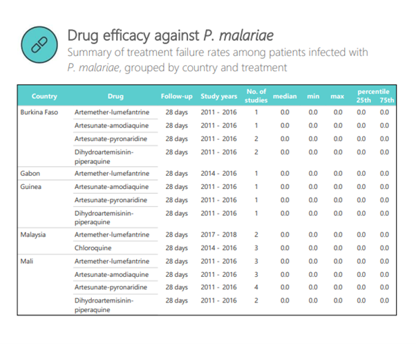
A sample of the data is shown below. The table summarizes the treatment failure rates among patients infected with P. malariae. The displayed data is grouped by country and treatment.
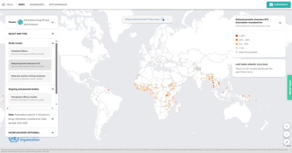
A sample of the map is shown below. The map details the area where the treatment failure rates among patients infected with P. falciparum and treated using artemether-lumefantrine.
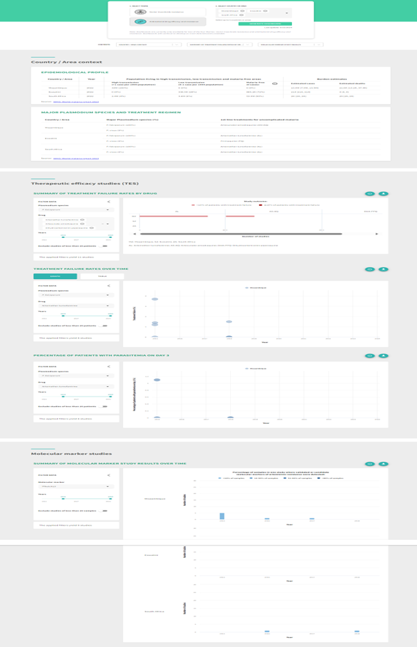
A sample of the dashboard is shown below. The dashboard details the area treatment failure rates by drug for South Africa, Eswatini and Mozambique. The dashboard provides a summary comparison across all countries selected.
Key points to consider
The website provides the users with various information related to Antimalarial drug resistance and can be assessed using various tools. The data and information is updated regularly.
Strengths
The dataset is widely used and evaluated.
It provides a number of useful information for antimalarial drug efficacy.
It provides a number of useful variables for drug resistance.
Reports and Data are updated regularly.
Limitations
The datasets have data on selected countries/areas affected by malaria only.
The most recent report may not contain all years of estimates.
Terms of use
The various datasets on the website are provided for all to use with free access. Please acknowledge all sources by citing one or more of the papers referenced. The website can also be acknowledged.
Examples of data use in literature
Adam M, Nahzat S, Kakar Q, Assada M, Witkowski B, Tag Eldin Elshafie A, et al. Antimalarial drug efficacy and resistance in malaria-endemic countries in HANMAT-PIAM_net countries of the Eastern Mediterranean Region 2016–2020: Clinical and genetic studies. Trop Med Int Health. 2023; 28(10): 817–829. https://doi.org/10.1111/tmi.13929
Kagoro, F.M., Allen, E., Mabuza, A. et al. Making data map-worthy—enhancing routine malaria data to support surveillance and mapping of Plasmodium falciparum anti-malarial resistance in a pre-elimination sub-Saharan African setting: a molecular and spatiotemporal epidemiology study. Malar J 21, 207 (2022). https://doi.org/10.1186/s12936-022-04224-4
Monroe A, Williams NA, Ogoma S, Karema C, Okumu F. Reflections on the 2021 World Malaria Report and the future of malaria control. Malar J. 2022 May 27;21(1):154. doi: 10.1186/s12936-022-04178-7. PMID: 35624483; PMCID: PMC9137259.
WHO,2009, Methods for surveillance of antimalarial drug efficacy Publication Item
How to use this data?
Evaluating trends in antimalarial drug resistance and communicating the results to a broad audience are important for dealing with the drug resistance threat.
As part of its normative function, WHO creates standard procedures to track the effectiveness, resistance, and prevention of antimalarial drugs and offers nations financial and technical support to put these protocols into practice. The Malaria Threats Map is derived from a global database containing the findings of various investigations. Updates to national policies for first- and second-line therapies for malaria are also influenced by these studies.
Download the data from the link and read in a sheet. Sometimes the data needs to be prepared before it is able to be plotted. The data can be saved for use.
How to plot this data?
To access the specific data used in the visualisations:
Below the right-most window labelled ‘Data Download’, click on the ‘DOWNLOAD DATA’ button.
Select the ‘Antimalarial drug efficacy and resistance’ tile.
Select ‘Therapeutic efficacy studies’ from the dropdown menu.
Select ‘ADD TO DOWNLOAD’, and then select ‘NEXT STEP’. Follow the prompts to download your file.
Show the code
library(readxl)library(EnvStats)library(tidyverse)library(rdhs)library(ggrepel)library(sf)library(rnaturalearth)library(rnaturalearthdata)library(whowmr)library(dplyr)library(stringr)library(tidyr)library(forcats)source(here::here("theme_health_radar.R"))# Define the elimination 8 countriese8_countries <-c("Botswana", "Eswatini", "Namibia", "South Africa", "Angola", "Mozambique", "Zambia", "Zimbabwe")# Read data from an Excel file, specifically from the "Data" sheetdata <- readxl::read_xlsx("data/MTM_THERAPEUTIC_EFFICACY_STUDY_20241216.xlsx",sheet ="Data")# Convert specific columns to numeric typedata$`POSITIVE_DAY_3 (days)`<-as.numeric(data$`POSITIVE_DAY_3 (days)`)data$TREATMENT_FAILURE_PP <-as.numeric(data$TREATMENT_FAILURE_PP)data$TREATMENT_FAILURE_KM <-as.numeric(data$TREATMENT_FAILURE_KM)# Reshape the data from wide to long format, selecting columns 12 to 16dat_long <- data |>pivot_longer(12:16, names_to ="Indicator", values_to ="Value") |>filter(COUNTRY_NAME %in% e8_countries) # Filter rows to include only E8 countries# Filter the long data for treatment failure per protocol (PP)dat_trt_pp <- dat_long |>filter(Indicator =="TREATMENT_FAILURE_PP")# Filter the long data for sample sizedat_sample <- dat_long |>filter(Indicator =="SAMPLE_SIZE")
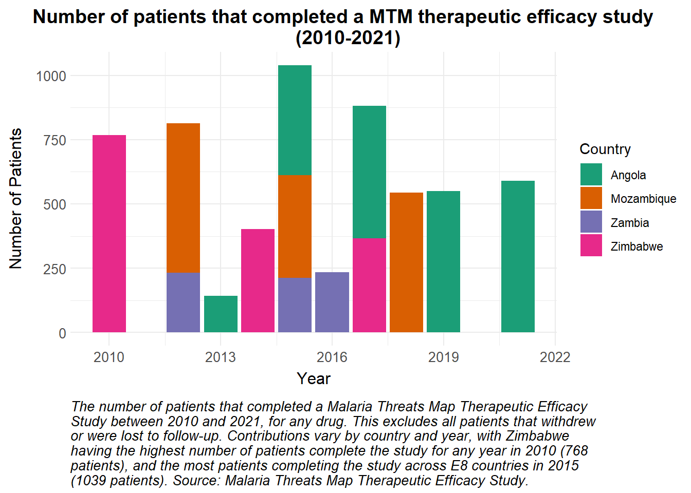
A stacked bar plot is a useful way of visualising a total value that is made up of a number of contributions. Here, the total number of patients that completed a MTM therapeutic efficacy study per year between 2010 and 2021 are visualised, with the contributions from each of four of the E8 countries highlighted.
Show the code
# Number of individuals that completed a study in the e8 countries in a given yearggplot(dat_sample, aes(x = YEAR_END, y = Value, fill = COUNTRY_NAME)) +geom_bar(stat ="identity", position ="stack") +# Apply the custom fill scale for Countryscale_fill_manual_health_radar() +# Apply the custom radar themetheme_health_radar() +# Center titletheme(plot.title.position ="plot") +# Add labels and title to the plotlabs(title ="Number of patients that completed a MTM therapeutic efficacy study \n (2010-2021)",y ="Number of Patients",x ="Year",fill ="Country",caption =str_wrap("The number of patients that completed a Malaria Threats Map Therapeutic Efficacy Study between 2010 and 2021, for any drug. This excludes all patients that withdrew or were lost to follow-up. Contributions vary by country and year, with Zimbabwe having the highest number of patients complete the study for any year in 2010 (768 patients), and the most patients completing the study across E8 countries in 2015 (1039 patients). Source: Malaria Threats Map Therapeutic Efficacy Study.", width =85) )
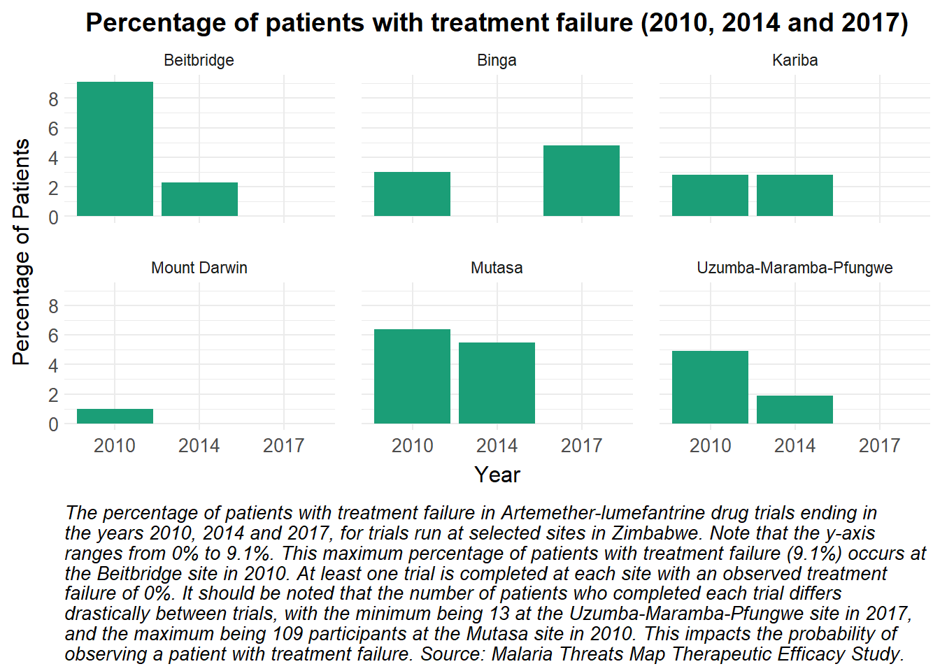
The percentage of patients who experienced treatment failure at different Zimbabwean sites can be visualised using a faceted bar plot.
Show the code
# Filter the data for Zimbabwe only, and remove sites Gokwe and Chiredzi - missing datafilt_data = dat_trt_pp |>filter(COUNTRY_NAME =="Zimbabwe"&!(SITE_NAME %in%c("Gokwe", "Chiredzi")), DRUG_NAME =="Artemether-lumefantrine")# Define a single color for the barssingle_color <-"#1b9e77"# Plot the data as a bar plotggplot(filt_data, aes(x =as.factor(YEAR_END), y = Value, fill = single_color)) +# Create bar plot with no legendgeom_bar(stat ="identity", position ="dodge", show.legend =FALSE) +# Use the health radar color schemescale_fill_manual_health_radar() +# Set y-axis ticks to increment by 2scale_y_continuous(breaks =seq(0, max(filt_data$Value, na.rm =TRUE), by =2)) +# Facet the plot by SITE_NAME, creating 6 subplotsfacet_wrap(~ SITE_NAME) +# Apply the health radar themetheme_health_radar() +# increase separation between panelstheme(panel.spacing =unit(1, "lines")) +# Add titles and labelslabs(title ="Percentage of patients with treatment failure (2010, 2014 and 2017)",x ="Year",y ="Percentage of Patients",caption =str_wrap("The percentage of patients with treatment failure in Artemether-lumefantrine drug trials ending in the years 2010, 2014 and 2017, for trials run at selected sites in Zimbabwe. Note that the y-axis ranges from 0% to 9.1%. This maximum percentage of patients with treatment failure (9.1%) occurs at the Beitbridge site in 2010. At least one trial is completed at each site with an observed treatment failure of 0%. It should be noted that the number of patients who completed each trial differs drastically between trials, with the minimum being 13 at the Uzumba-Maramba-Pfungwe site in 2017, and the maximum being 109 participants at the Mutasa site in 2010. This impacts the probability of observing a patient with treatment failure. Source: Malaria Threats Map Therapeutic Efficacy Study.", width =100))
Show the code
# Is the treatment working nearly perfectly, or is there some other factor potentially at play with a number of sites having treatment failure of 0% in 2017? There is no missing data (i.e. these aren't NaNs), and the sample sizes range between 13 and 103, so they are mostly respectable. I feel like I may have missed a mitigating factor which should be mentioned in the caption
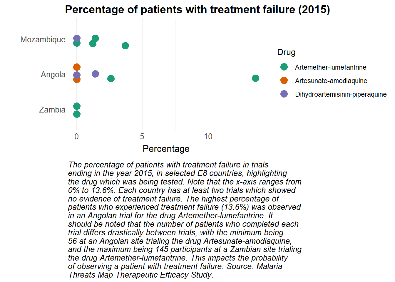
A lollipop plot can be used to visualise the percentage of patients who experienced treatment failure on different drugs, in different countries. A problem is encountered, however, if multiple trials in the same country had the same percentage of patients with treatment failure. Jittering is used to solve this problem, which decreases the visual appeal but ensures that important information is not obscured.
Show the code
library(stringr)# Set seed to ensure identical jittering every time the plot is builtset.seed(18)dat_trt_pp |># Filter the data to include only rows where Value is not NA and YEAR_END is 2015filter(is.na(dat_trt_pp$Value) ==FALSE, YEAR_END ==2015) |># Create ggplot object with the filtered dataggplot(aes(x =fct_reorder(COUNTRY_NAME, Value, .na_rm =FALSE), # Reorder COUNTRY_NAME based on Valuey = Value, # Set y-axis to Valuecolor = DRUG_NAME)) +# Color points by DRUG_NAME# Add grey segments from y=0 to the value for each countrygeom_segment(aes(x = COUNTRY_NAME, xend = COUNTRY_NAME, y =0, yend = Value), color ="grey") +# Add jittered points to the plot, sized at 4geom_jitter(size =4, height =0, width =0.2) +# Flip the coordinates for a horizontal bar plotcoord_flip() +# Apply custom color scalescale_colour_manual_health_radar() +# Apply custom themetheme_health_radar() +# Shift the title positiontheme(plot.title.position ="plot") +# Add labels and title to the plotlabs(title ="Percentage of patients with treatment failure (2015)",caption =str_wrap("The percentage of patients with treatment failure in trials ending in the year 2015, in selected E8 countries, highlighting the drug which was being tested. Note that the x-axis ranges from 0% to 13.6%. Each country has at least two trials which showed no evidence of treatment failure. The highest percentage of patients who experienced treatment failure (13.6%) was observed in an Angolan trial for the drug Artemether-lumefantrine. It should be noted that the number of patients who completed each trial differs drastically between trials, with the minimum being 56 at an Angolan site trialing the drug Artesunate-amodiaquine, and the maximum being 145 participants at a Zambian site trialing the drug Artemether-lumefantrine. This impacts the probability of observing a patient with treatment failure. Source: Malaria Threats Map Therapeutic Efficacy Study.", width =65),x ="",y ="Percentage", colour ="Drug")
How can this data be used in disease modelling?
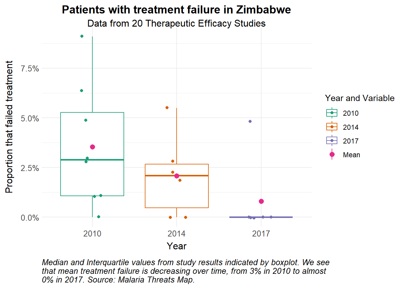
Therapeutic efficacy studies assess how well antimalarial drugs clear infections and are an indicator of treatment success. Case management with Artemisinin-based Combination Therapy (ACTs) is a critical part of any country’s control strategy, and as such, representing it accurately in the disease model is key. Twenty therapeutic efficacy studies following treatment with Artemether-lumefantrine were done in Zimbabwe between 2010 and 2017. We use these to inform the treatment dynamics in the health system.
Preparing the data
We calculate the mean probability of treatment failure in each year to inform the model.
Show the code
# Load the datatherapeutic_eff_data <-read_excel("data/MTM_THERAPEUTIC_EFFICACY_STUDY_20250324.xlsx",sheet =2) |>mutate(TREATMENT_FAILURE_PP =as.numeric(TREATMENT_FAILURE_PP)/100)# Calculate mean probability of treatment failure over timemean_pf <- therapeutic_eff_data |>group_by(YEAR_END) |>summarise(mean =mean(TREATMENT_FAILURE_PP)) |>mutate(time =c(365*10, 365*15, 365*18)) # to get time series for 2010, 2014 and 2017 with simulation beginning in 2000therapeutic_eff_data |>ggplot(aes(x =as_factor(YEAR_END), y = TREATMENT_FAILURE_PP)) +geom_boxplot(aes(colour =as.factor(YEAR_END)), outlier.shape =NA) +stat_summary(aes(colour ="Mean"), fun = mean) +geom_jitter(aes(colour =as.factor(YEAR_END)), width =0.15) +scale_y_continuous(labels = scales::percent) +theme_health_radar() +scale_colour_manual_health_radar() +labs(title ="Patients with treatment failure in Zimbabwe",subtitle =str_wrap("Data from 20 Therapeutic Efficacy Studies"),x ="Year",y ="Proportion that failed treatment",colour ="Year and Variable", caption =str_wrap("Median and Interquartile values from study results indicated by boxplot. We see that mean treatment failure is decreasing over time, from 3% in 2010 to almost 0% in 2017. Source: Malaria Threats Map."))
Model assumptions
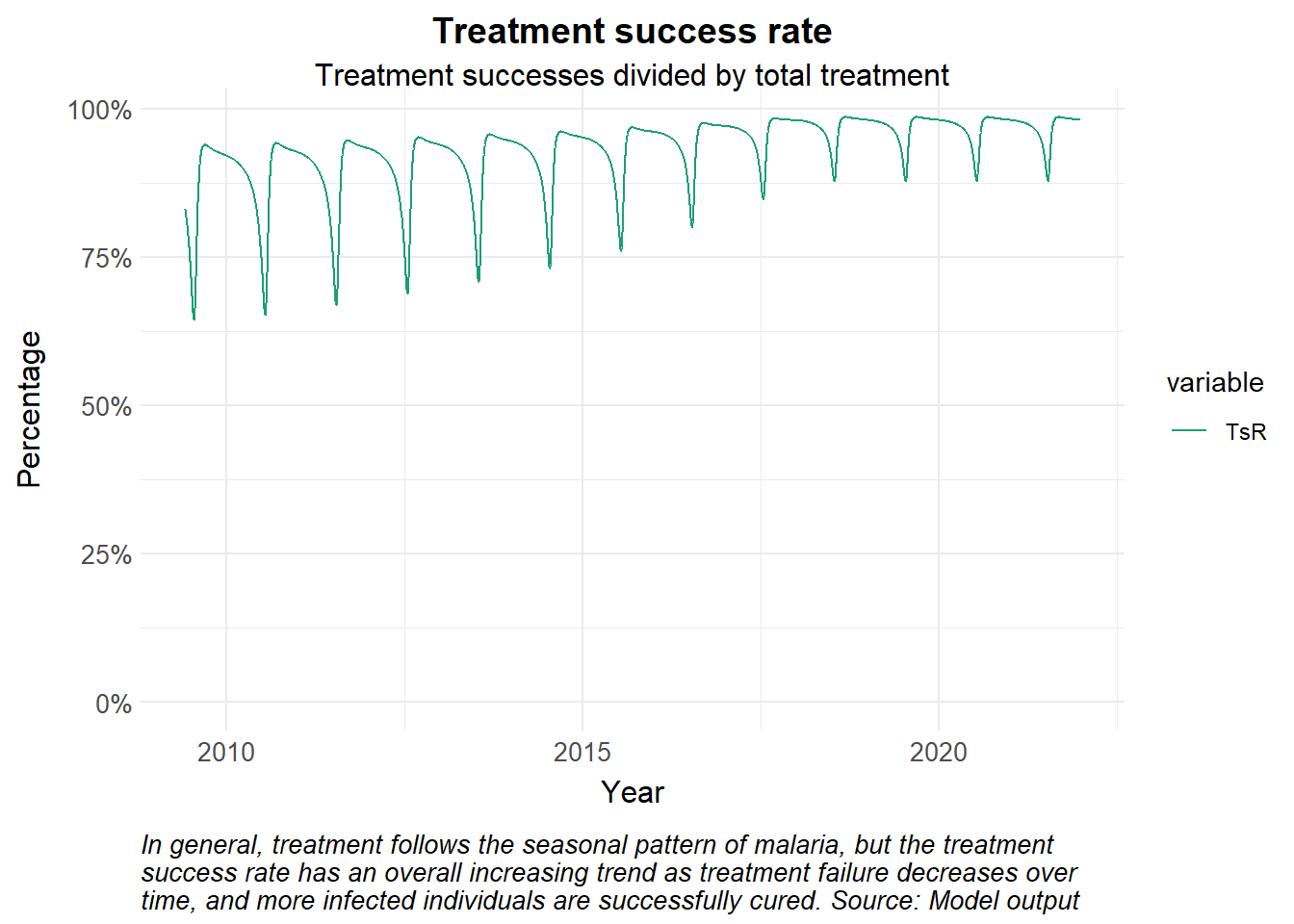
Using a simple model, we demonstrate how treatment failure is incorporated, and plot the values for incidence. We start with the time-dependent parameter \(pf(t)\) for treatment failure among patients infected with Plasmodium falciparum in Zimbabwe. We assume that patients are treated, experience treatment failure and express clinical symptoms again within the study follow up period of 28 days (see parameters for \(r\) and \(sigma\)).
Show the code
# Time points for the simulationY =22# Years of simulationtimes <-seq(0, 365*Y, 1) # time in days# Create a time-dependent function for treatment failurepf_function <-approxfun(mean_pf$time, mean_pf$mean, rule =2) # linear interpolation# Define basic dynamic Human-static Vector model ####seirs <-function(times, start, parameters, pf_function) {with(as.list(c(parameters, start)), { P = S + E + A + C + Tr + Tf + R + G# Seasonality seas.t <- amp*(1+cos(2*pi*(times/365- phi)))# Force of infection Infectious <- C + Tf + zeta_a*A + zeta_t*Tr # infectious reservoir lambda = ((a^2*b*c*m*Infectious/P)/(a*c*Infectious/P+mu_m)*(gamma_m/(gamma_m+mu_m)))*seas.t pf_t <-pf_function(times)# Differential equations/rate of change dS = mu_h*P - lambda*S + rho*R - mu_h*S dE = lambda*S - (gamma_h + mu_h)*E dA = pa*gamma_h*E + pa*gamma_h*G +omega*C - (delta + mu_h)*A dC = (1-pa)*gamma_h*E + (1-pa)*gamma_h*G + sigma*Tf - (tau + omega + mu_h)*C dTr = tau*C - (r + mu_h)*Tr dTf = pf_t*r*Tr - (sigma + mu_h)*Tf dR = delta*A + (1-pf_t)*r*Tr - (lambda + rho + mu_h)*R dG = lambda*R - (gamma_h + mu_h)*G dCInc = lambda*(S+R) output <-c(dS, dE, dA, dC, dTr, dTf, dR, dG, dCInc)list(output) })}# Input definitions #####Initial valuesstart <-c(S =550000, # susceptible humansE =300000, # exposed and infected humansA =150000, # asymptomatic and infectious humansC =155000, # clinical and symptomatic humansTr =80000, # treated humansTf =20000, # treated humans that have had treatment failureR =200000, # recovered and semi-immune humansG =155000, # secondary-exposed and infected humansCInc =0# cumulative incidence ) # Parametersparameters <-c(a =0.28, # human feeding rate per mosquitob =0.3, # transmission efficiency M->Hc =0.3, # transmission efficiency H->Mm =3, # mosquito-human ratiogamma_m =1/10, # rate of onset of infectiousness in mosquitoesmu_m =1/12, # natural birth/death rate in mosquitoesmu_h =1/(59*365), # natural birth/death rate in humansgamma_h =1/12, # rate of onset of infectiousness in humansr =1/7, # rate of loss of infectiousness after treatmentrho =1/365, # rate of loss of immunity after recoverydelta =1/150, # natural recovery rateomega =1/10, # rate of loss of symptoms in untreated clinical infectionzeta_a =0.2, # relative infectiousness of asymptomatic infectionszeta_t =0.1, # relative infectiousness of treated infectionstau =1/3, # treatment seeking ratesigma =1/21, # rate of symptomatic recurrence after treatment failurepa =0.35, # probability of asymptomatic infection#pf = 0.0228, # probability of treatment failureamp =0.45, # amplitudephi =200# phase angle; start of season)# Run the modelout <-ode(y = start, times = times, func = seirs, parms = parameters,pf_function = pf_function)# Post-processing model output into a dataframedf <-as_tibble(as.data.frame(out)) |>mutate(P = S + E + A + C + Tr + Tf + R + G,Inc =c(0, diff(CInc)),TsR = Tr/(Tr+Tf)) |>pivot_longer(cols =-time, names_to ="variable", values_to ="value") |>mutate(date =ymd("2000-01-01") + time)df |>filter(variable %in%c("TsR"), date >ymd("2009-06-01")) |>ggplot() +geom_line(aes(x = date, y = value, colour = variable)) +theme_health_radar() +scale_colour_manual_health_radar() +scale_y_continuous(labels = scales::percent, limits =c(0, NA)) +labs(title ="Treatment success rate", subtitle ="Treatment successes divided by total treatment",x ="Year",y ="Percentage",caption =str_wrap("In general, treatment follows the seasonal pattern of malaria, but the treatment success rate has an overall increasing trend as treatment failure decreases over time, and more infected individuals are successfully cured. Source: Model output")) +theme(guides ="none")
Exploring uncertainty
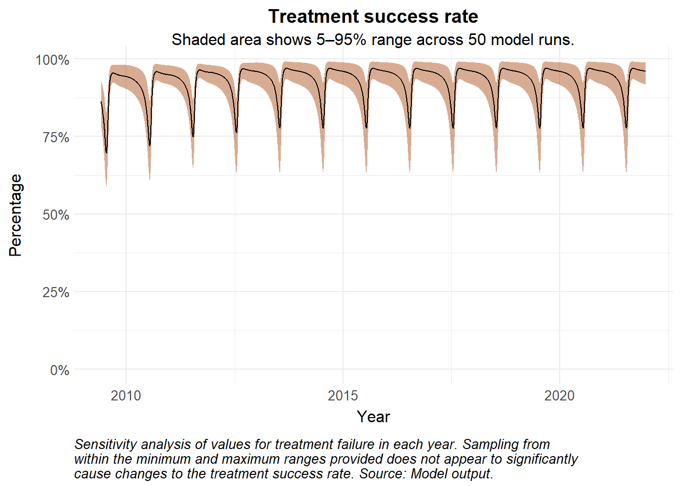
To account for the uncertainty in the probability of treatment failure \(pf\), we sample the value from a triangular distribution and explore the range of the runs.
Show the code
library(triangle)library(lhs)set.seed(123)runs <-50results_list <-vector("list", runs)# Latin Hypercube Sample matrix across 3 years for 50 runslhs_matrix <-randomLHS(runs, 3)# Run simulationsfor (i in1:runs) {# Summarise treatment failure stats by year# Assume mode to be the mean for triangular distribution sampling pf_data <- therapeutic_eff_data |>group_by(YEAR_END) |>summarise(min =min(TREATMENT_FAILURE_PP), mode =mean(TREATMENT_FAILURE_PP),max =max(TREATMENT_FAILURE_PP),.groups ="drop" )# Time durations (in days) from start of simulation# Sample values probability of treatment failure from a triangular distribution for each year pf_data <- pf_data |>mutate(time =c(365*5, 365*10, 365*13))# Use LHS to sample from triangular distribution pf_values <- pf_data |>mutate(pf_sampled =map2_dbl(row_number(), mode, ~qtri(lhs_matrix[i, .x], min = min[.x], mode = .y, max = max[.x])))# Time-dependent interpolation for sampled values pf_run_function <-approxfun(pf_values$time, pf_values$pf_sampled, rule =2)# Run the ODE sens_out <-ode(y = start, times = times, func = seirs, parms = parameters,pf_function = pf_run_function)# Store and tidy output results_list[[i]] <-as_tibble(as.data.frame(sens_out)) |>mutate(P = S + E + A + C + Tr + Tf + R + G,Inc =c(0, diff(CInc)),TsR = Tr/(Tr+Tf)) |>pivot_longer(cols =-time, names_to ="variable", values_to ="value") |>mutate(date =ymd("2004-01-01") + time,run = i)}# Combine all runs into one dataframesens_df <-bind_rows(results_list)median_sens <- sens_df |>group_by(time) |>filter(variable =="TsR") |>summarise(median =median(value), lower =quantile(value, 0.05),upper =quantile(value, 0.95),.groups ="drop") |># plot median values and 95% confidence intervalsmutate(date =ymd("2000-01-01") + time)sens_df |>filter(variable =="TsR", date >ymd("2009-06-01")) |>ggplot() +# geom_line(aes(x = date, y = value, colour = as_factor(run), group = run), alpha = 0.5) + # if you want to see individual runsgeom_ribbon(data = median_sens |>filter(date >ymd("2009-06-01")), aes(x = date, ymin = lower, ymax = upper), fill = theme_health_radar_colours[12], alpha =0.5) +geom_line(data = median_sens |>filter(date >ymd("2009-06-01")), aes(x = date, y = median, linetype ="Median"), linewidth =0.5) +theme_health_radar() +scale_y_continuous(labels = scales::percent, limits =c(0, NA)) +labs(title ="Treatment success rate", subtitle ="Shaded area shows 5–95% range across 50 model runs.",x ="Year",y ="Percentage",caption =str_wrap("Sensitivity analysis of values for treatment failure in each year. Sampling from within the minimum and maximum ranges provided does not appear to significantly cause changes to the treatment success rate. Source: Model output.")) +theme(legend.position ="none")
Policy implications
Treatment failure and antimalarial drug resistance can lead to prolonged infectious periods, recrudescence, or higher onward transmission, all of which increase the burden on the health system. Policymakers may need to evaluate the performance of first- and second-line therapies based off of surveillance and other insights from therapeutic efficacy studies, and perhaps recommend changes to treatment guidelines such as the use of triple ACTs or monotherapies.