About the data
The United Nations Population Division produces and regularly updates estimates of various demographic indicators for 237 countries or areas, covering both historical data and future projections. These estimates and projections are based on available censuses and nationally representative sample surveys.
Indicators such as population size and density, total births and deaths, infant mortality rate, median age and population sex ratio are available. Data for countries and their territories are recorded separately as well as together. Grouped data for continents or groups of countries, states or territories such as “Small Island Developing States (SIDS)” or “Land-locked Countries” is also available.
The data offers comprehensive insights into global demographic trends, supporting policy-making, research, and development initiatives. It’s a key resource for understanding historical population changes and projecting future dynamics. For more information regarding the data, visit the United Nations Population Division website.
Accessing the data
You can access the data by following the instructions below:
- Navigate to the UN population division home page
- Select Data, then select World Population Prospects.
- This will take you to a new page. If you only require a subset of the available data, do the following:
- Navigate to Data then Data Portal.
- Choose the desired indicators, locations and years from the dropdown menus, and then press “Search”. The resulting page will allow you to view plots of the data.
- Navigating to Table then Export then CSV will download the selected data as a CSV file. Be aware that searching a large dataset can take a long time. Using the “Download Center” (Step 4) may be more efficient in this case.
- To download the full dataset which we use in this tutorial, select Data then Download Center from the World Population Prospects page. The webpage to which you have now navigated provides options for download.
- Under the title “Major topic/ Special groupings”, select the “CSV format” option. Information about the data will be displayed. Scrolling down reveals a table containing links to download various CSV files. For the purposes of this tutorial, the file containing data from the subgroup “Demographic Indicators”, labelled “1950-2100, medium (GZ, 15.79 MB)”, will be used.
What does the data look like?
This dataset contains estimates or projections for a range of demographic indicators over a broad time period. It is not separated by age and is presented in wide format, with each row providing values for all indicators for a given country or area in a given year.
The indicator labels are not all self explanatory. Below is a table which provides slightly more detail for each indicator:
Key points to consider
Estimations and Projections:
This dataset uses data from censuses and other surveys to generate estimations of demographic indicators for past and present years, and projections of these same indicators for future years. Estimates and projections become more uncertain further into the future.
National Level - Ignoring Spatial Heterogeneity:
Modelling malaria transmission based on population sizes at a national level can overlook important spatial heterogeneities:
Regional variations: Malaria transmission can vary significantly between different regions within a country due to differences in population densities and other demographic factors.
Local hotspots: Even within regions, there can be local hotspots of malaria transmission due to factors such as population density and human behavior.
Population movement: The movement of people between different areas can introduce or reintroduce malaria parasites, affecting transmission dynamics. By only looking at movement of people between countries, we will miss these subnational movements.
While some of the locations for which data are provided are territories, regions or states, there are no countries for which the data can be separated by subregion such as province.
Citing the data
United Nations, Department of Economic and Social Affairs, Population Division (2024). World Population Prospects 2024, Online Edition.
How to use this dataset
Long format tables are often easier to work with. Below is a code chunk which converts the dataset as downloaded from the UN Population Division webpage to a longer format, and prints out the Location, Time, Indicator and Value columns.
Show the code
# Read in data

un_pop <- read_csv2("data/WPP2024_Demographic_Indicators_Medium3.csv",
                   col_types = "iiccciicicicinnnnnnnnnnnnnnnnnnnnnnnnnnnnnnnnnnnnnnnnnnnnnnnnnnnnnn")

un_pop_long <- un_pop |>
  pivot_longer(cols = 14:ncol(un_pop), names_to = "Indicator", values_to = "Value") |>
  mutate(Value = Value/1000) # Convert to thousands

un_pop_long |>
  select(Location, Time, Indicator, Value) |>
  head(n = 10) |>
  gt() |>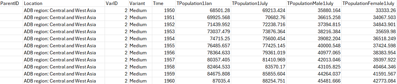
tab_options(table.align = "left")| Location | Time | Indicator | Value |
|---|---|---|---|
| Mozambique | 1950 | TPopulation1Jan | 5878.439 |
| Mozambique | 1950 | TPopulation1July | 5910.225 |
| Mozambique | 1950 | TPopulationMale1July | 2891.818 |
| Mozambique | 1950 | TPopulationFemale1July | 3018.407 |
| Mozambique | 1950 | PopDensity | 75.157 |
| Mozambique | 1950 | PopSexRatio | 958.061 |
| Mozambique | 1950 | MedianAgePop | 19.173 |
| Mozambique | 1950 | NatChange | 119.545 |
| Mozambique | 1950 | NatChangeRT | 20.227 |
| Mozambique | 1950 | PopChange | 63.572 |
How to plot this dataset
Show the code
# Define the elimination 8 countries
e8_countries <- c("Botswana", "Eswatini", "Namibia", "South Africa", "Angola", "Mozambique", "Zambia", "Zimbabwe")
# Load the map data for Africa
e8_africa <- ne_countries(continent = "Africa", returnclass = "sf") |>
mutate(name = if_else(name=="eSwatini", "Eswatini", name)) |> # Correct the name for Eswatini
filter(name %in% e8_countries) # Filter to include only the elimination 8 countries
# Filter long table so that only the 1 Jan population estimates for 2024 are shown
dat_long_pop2024 <- filter(un_pop_long, Time == 2024 & Indicator == "TPopulation1Jan")
# Merge the map data with your data
e8_data <- e8_africa |>
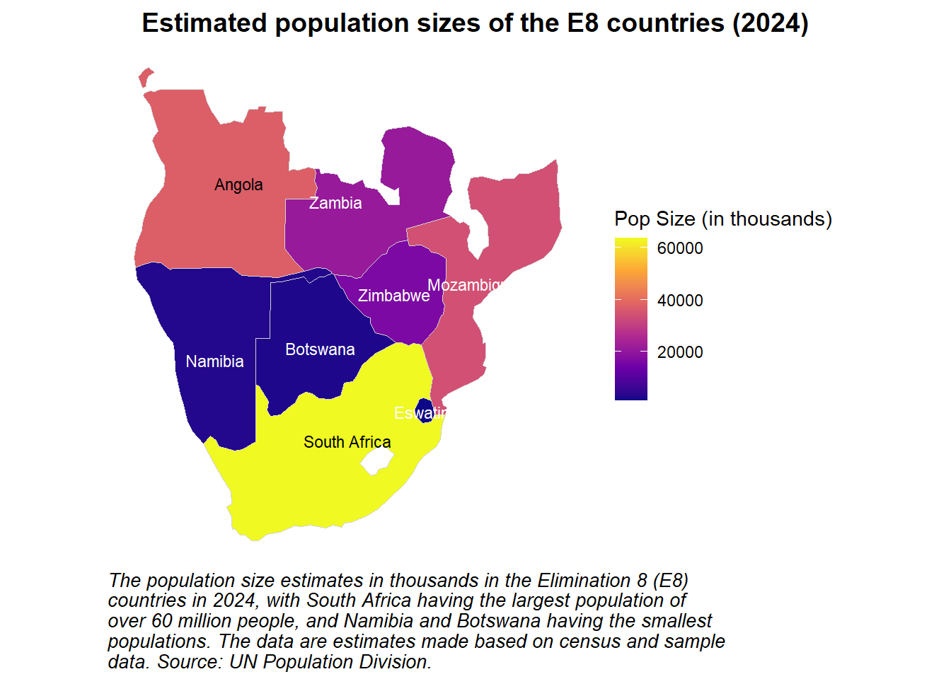
left_join(dat_long_pop2024 |> mutate(), by = c("name" = "Location")) A map which fills each country according to their estimated population sizes is displayed below. This is an effective way of visualising the population sizes of various countries at a given point in time.
Show the code
# Create the choropleth map
ggplot(data = e8_data) +
  # Plot the map with population data
  geom_sf(aes(fill = Value), color = "lightgrey", size = 0.3) +
  theme_health_radar() +  # Apply custom theme
  # Name fill scale for continuous data
  scale_fill_continuous_health_radar(name = "Pop Size (in thousands)") +
  # Add caption and title to the plot
  labs(title = "Estimated population sizes of the E8 countries (2024)",
       caption = str_wrap("The population size estimates in thousands in the Elimination 8 (E8) countries in 2024, with South Africa having the largest population of over 60 million people, and Namibia and Botswana having the smallest populations. The data are estimates made based on census and sample data. Source: UN Population Division.", width = 70)) +
  # Conditional text color to ensure readability
  geom_sf_text(aes(label = name, color = ifelse(Value > quantile(Value, 0.75), "black", "white")), size = 3) +
  # Apply color scale
  scale_color_identity() +
  # Remove x- and y-axis and grid lines
  theme(
    plot.caption.position = "plot",
    plot.title.position = "plot",
    axis.title.x=element_blank(),
    axis.text.x=element_blank(),
    axis.ticks.x=element_blank(),
    axis.title.y=element_blank(),
    axis.text.y=element_blank(),
    axis.ticks.y=element_blank(),
    panel.grid.major = element_blank(),
    panel.grid.minor = element_blank()
  )
This UN dataset provides estimations and projections for population sizes over time. An easy way to visualise these data is using a line plot, with different lines representing the populations of different countries.
Show the code
# Create a line plot for population size in the E8 countries over time
un_pop_long |>
  # Filter for the E8 countries
  filter(Location |>
           stringr::str_detect("Angola|Botswana|Eswatini|Mozambique|Namibia|South Africa|Zambia|Zimbabwe") &
           Indicator == "TPopulation1Jan") |>
  ggplot(aes(x = Time, y = Value, group = Location, color = Location)) +
  # Plot the population data as lines
  geom_line(lwd = 1) +
  # Add a dashed vertical line at the year 2024
  geom_vline(xintercept = 2024, linetype = "dashed") +
  # Apply manual color scale for "color" aesthetic (lines)
  scale_colour_manual_health_radar() +
  # Apply custom theme
  theme_health_radar() +
  # Add labels and title to the plot
  labs(
    title = "Estimated and projected population sizes (1950-2100)",
    x = "Year",
    y = "Population Size (in thousands)",
    color = "E8 Country",
    caption = str_wrap("The estimated population sizes in thousands in the Elimination 8 (E8) countries from 1950 to 2024, and projected population sizes between 2025 and 2100. The dashed black line indicates the year in which these estimations and projections were produced: 2024. These data are recorded annually, and may therefore miss seasonal variations in population size. Population growth is evident across all eight countries since 1950, with many of the populations projected to plateau by 2100. Source: UN Population Division.", width = 85))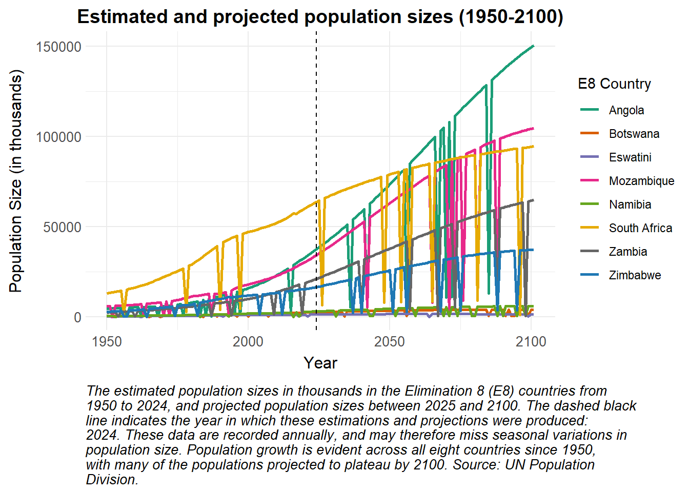
Stacked and faceted bar plots can be used to visualise the contributions of males and females to the total populations of various countries at a few distinct time points, as seen below.
Show the code
# Filter the data for the E8 countries, the indicators "TPopulationFemale1July" and "TPopulationMale1July", and for the years 2000, 2010, and 2020
dat_pop_mvf <- un_pop_long |>
  filter(Location |>
           stringr::str_detect("Angola|Botswana|Eswatini|Mozambique|Namibia|South Africa|Zambia|Zimbabwe") &
           Indicator %in% c("TPopulationFemale1July", "TPopulationMale1July") &
           Time %in% seq(2000, 2020, 10))
# Rename the indicators to more readable labels
dat_pop_mvf[dat_pop_mvf == "TPopulationFemale1July"] <- "Female"
dat_pop_mvf[dat_pop_mvf == "TPopulationMale1July"] <- "Male"
# Create ggplot object
ggplot(dat_pop_mvf, aes(x = Time, y = Value, fill = Indicator)) +
  # Create stacked bars
  geom_bar(stat = "identity", position = "stack") +
  # Create separate plots for each country
  facet_wrap(~ Location, scales = "free_y") +
  # Apply the custom fill scale for sex
  scale_fill_manual_health_radar() +
  # Apply the custom radar theme
  theme_health_radar() +
  labs(
    title = "Estimated or projected population sizes in 2000, 2010 and 2020",
    x = "Year",
    y = "Population Size (in thousands)",
    fill = "Sex",
caption = str_wrap("The estimated or projected numbers of males and females making up the populations of each of the Elimination 8 (E8) countries in 2000, 2010 and 2020. Note the difference in y-axis range for each stacked barplot, indicating different population sizes. No country appears to have a ratio of males to females which differs greatly from 1:1. Source: UN Population Division.", width = 85)) 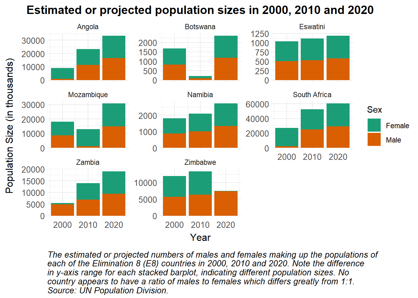
How can this data be used in disease modelling?
Models aim to provide abstract simulations of real-life dynamics. As such, it is important to include realistic parameters pertaining to birth and death, and the overall growth of the population. Using data from the UN Population Division Data Portal, we use the crude birth and death rates to inform population growth in the example below. While age-specific death rates may be more valuable, we use these as a proxy for average death rates across the population.
Preparing the data
We plot the values for crude birth and death rates in Mozambique obtained from the portal below.
Show the code
crude_births <- read_csv("data/unpopulation_dataportal_births.csv") |>
  distinct(Time, .keep_all = TRUE) # remove duplicates
crude_deaths <-  read_csv("data/unpopulation_dataportal_deaths.csv")

rates <- bind_rows(crude_births, crude_deaths)

rates |>
  ggplot(aes(x = Time)) +
  geom_line(aes(y = Value, colour = IndicatorName)) +
  theme_health_radar() +
  scale_colour_manual_health_radar() +
  labs(x = "Year",
       y = "per 1000 population",
       title = "Crude birth and death rates in Mozambique",
       colour = "Indicator",
       caption = "Birth rates are significantly higher than death reates, as is common in many growing African countries. Source: UN Population Division.")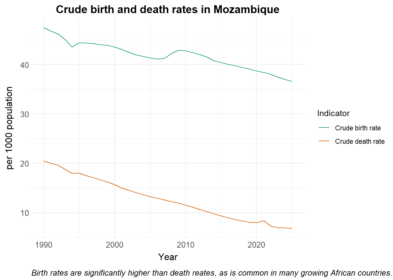
Changes in human population
Considering malaria immunity increases with age, the introduction of new susceptibles (through the birth rate) can help sustain transmission, and skew the disease burden to younger individuals, i.e. children. In order to factor this in, we show a simple model with no interventions. We assume the vector population remains constant. The Climate Research Unit Timeseries page provides a demonstration of changes to the vector population in the context of disease modeling.
Show the code
library(deSolve)

# Time points for the simulation
Y = 35 # Years of simulation
times <- seq(0, 365*Y, 1) # time in days


# Define basic dynamic Human-static Vector model ####
seirs <- function(times, start, parameters, crude_births, crude_deaths)  {
  with(as.list(c(parameters, start)), {
    P = S + E + A + C + R + G
    M = Sm + Em + Im
    m = M / P

    pop_time <- seq(1990, 2025, by = 1/365)
    birth_rates <- approx(crude_births$Time, crude_births$Value, pop_time, method = "constant", rule = 2)$y
    death_rates <- approx(crude_deaths$Time, crude_deaths$Value, pop_time, method = "constant", rule = 2)$y

    # Seasonality
    seas.t <- amp*(1+cos(2*pi*(times/365 - phi)))

    # Force of infection
    Infectious <- C + zeta_a*A # infectious reservoir
    lambda = ((a^2*b*c*m*Infectious/P)/(a*c*Infectious/P+mu_m)*(gamma_m/(gamma_m+mu_m)))*seas.t

    time_index <- floor(times + 1)
    mu_b <- birth_rates[time_index]/1000/365 # crude birth rate in humans
    mu_h <- death_rates[time_index]/1000/365 # crude death rate in humans

    # Differential equations/rate of change
    dSm = 0
    dEm = 0
    dIm = 0

    dS = mu_b*P - lambda*S + rho*R - mu_h*S
    dE = lambda*S - (gamma_h + mu_h)*E
    dA = pa*gamma_h*E + pa*gamma_h*G - (delta + mu_h)*A
    dC = (1-pa)*gamma_h*E + (1-pa)*gamma_h*G - (r + mu_h)*C
    dR = delta*A + r*C - (lambda + rho + mu_h)*R
    dG = lambda*R - (gamma_h + mu_h)*G

    dCInc = lambda*(S+R)

    output <- c(dSm, dEm, dIm, dS, dE, dA, dC, dR, dG, dCInc)
    list(output)
  })
}

# Input definitions ####

#Initial values
start <- c(Sm = 30000000, # susceptible mosquitoes
           Em = 20000000, # exposed and infected mosquitoes
           Im = 800000, # infectious mosquitoes
           S = 6000000, # susceptible humans
           E = 3000000, # exposed and infected humans
           A = 1000000, # asymptomatic and infectious humans
           C = 1000000, # clinical and symptomatic humans
           R = 2000000, # recovered and semi-immune humans
           G = 1000000, # secondary-exposed and infected humans
           CInc = 0 # cumulative incidence
           )


# Parameters
parameters <- c(a = 0.28, # human feeding rate per mosquito
           b = 0.3, # transmission efficiency M->H
           c = 0.3, # transmission efficiency H->M
           gamma_m = 1/10, # rate of onset of infectiousness in mosquitoes
           mu_m = 1/12, # natural birth/death rate in mosquitoes
           gamma_h = 1/10, # rate of onset of infectiousness in humans
           r = 1/7, # rate of loss of infectiousness after treatment
           rho = 1/365, # rate of loss of immunity after recovery
           delta = 1/150, # natural recovery rate
           zeta_a = 0.4, # relative infectiousness of asymptomatic infections
           pa = 0.1, # probability of asymptomatic infection
           amp = 0.8, # Amplitude
           phi = 250 # phase angle; start of season
)

# Run the model
out <- ode(y = start,
           times = times,
           func = seirs,
           parms = parameters,
           crude_births = crude_births,
           crude_deaths = crude_deaths)


# Post-processing model output into a dataframe

df <- as_tibble(as.data.frame(out)) |>
  mutate(P = S + E + A + C + R + G) |>
  pivot_longer(cols = -time, names_to = "variable", values_to = "value") |>
  mutate(date = ymd("1990-01-01") + time)

df |>
  filter(variable == "P") |>
  ggplot() +
  geom_line(aes(x = date, y = value, colour = variable)) +
  theme_health_radar() +
  scale_colour_manual_health_radar() +
  scale_y_continuous(labels = scales::label_number(suffix = " M", scale = 1e-6)) +
  labs(
    title = "Growth in human population in Mozambique over time",
    x = "Year",
    y = "Population size in millions",
    colour = "Population",
    caption = str_wrap("Changes in the total human population over time. Source: Model output")
  )  +
  theme(legend.position = "none")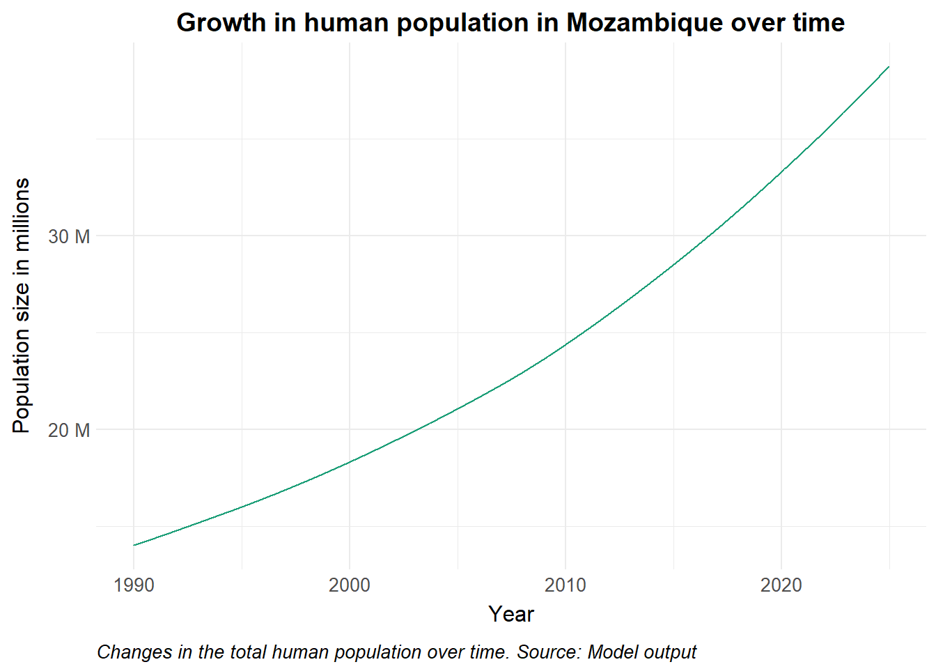
Policy implications
Forecasting resource allocation involves planning for demographic shifts, health infrastructure capacity, and the overall burden on health systems. As newborn susceptibles enter the population, we also anticipate that herd immunity may gradually erode over time, and reinforcing the need for sustained investment in control interventions.