The WHO World malaria report, released on an annual basis, provides a comprehensive and up-to-date assessment of trends in malaria control and elimination across the globe. The annexes to the report provide useful information on the data sources and methods used to compile the World Malaria Report, a set of regional malaria profiles and tables of historical time series of case data, commodity distribution, funding amounts and policy adoption.
These datasets provide information on long term trends in malaria control and enable comparison between countries. The data provided are on an annual time scale at the national level, and would not be suitable for subnational analysis or to explore seasonal trends in malaria.
Accessing the data
The reports can be accessed on the WHO website. Each report has a web page that includes useful contextual information and additional resources. The “Annexes in Excel format” will download as a zip file that should be extracted. The annexes can be viewed in the original report in PDF format, though for modelling it is usually preferable to have an excel spreadsheet.
The most recent report may not contain all years of estimates. Should earlier years be required, one can access the annexes from earlier reports and merge these.
What do the data look like?
Description
The list of annexes may vary annually. The information included typically looks like this. Data are available for each country and annually. Some datasheets contain a few years of data, while others report data for the most recent year. To make a longer time series of data, you can access older world malaria reports and annexes from the WHO. Be careful to check the data definitions and information on methodology to be sure that datasets can be concatenated.
The annexes can be found in the report itself as in the following examples:
The annexes can also be downloaded as Excel documents from the report page.
Example of the annex layout. This example is from the 2023 World malaria report. Note that the annexes are paired with the report and should be interpreted as such.
Annex 1
Data sources and methods
Annex 2
Number of ITNs distributed through campaigns in malaria endemic countries
Annex 3
WHO Regional profiles
Annex 4
Data tables and methods
A. Policy adoption
B. Antimalarial drug policy
C. Funding for malaria control
D. Commodities distribution and coverage
E. Household survey results
F. Population denominator for case incidence and mortality rate, and estimated malaria cases and deaths
G. Population denominator for case incidence and mortality rate, and reported malaria cases by place of care
H. Reported malaria cases by method of confirmation
I. Reported malaria cases by species
J. Reported malaria deaths
K. Methods for Tables A-D-G-H-I-J
Key points to consider
Pitfalls of Annual Data:
Using annual data for your analysis can lead to several pitfalls:
Seasonal variations: Annual data may not capture the seasonal patterns of malaria transmission, which can be influenced by factors such as rainfall, temperature, and vector abundance. This can lead to an over- or underestimation of the disease burden and the impact of interventions.
Temporal aggregation: Aggregating data annually may mask important short-term dynamics, such as outbreaks or the immediate impact of interventions.
Reporting - Incidence vs. Prevalence Data:
It is important to distinguish between incidence and prevalence data when performing your analysis:
Incidence data: Incidence refers to the number of new cases of malaria occurring in a population over a specified period. It provides information on the rate at which new infections occur and is more sensitive to changes in transmission dynamics.
Prevalence data: Prevalence refers to the proportion of the population that has malaria at a given point in time. It provides a snapshot of the disease burden but does not capture the rate of new infections.
Difference Between Policy and Implementation:
There can be discrepancies between the intended policy for ITN distribution and the actual implementation on the ground. Consider the following:
Coverage: The planned ITN coverage may differ from the actual coverage achieved due to factors such as logistics, access to remote areas, and population acceptance.
Timing: The timing of ITN distribution campaigns may vary from the planned schedule. This can affect the impact of ITNs on malaria transmission, particularly if the distribution does not align with peak transmission seasons.
Effectiveness: The effectiveness of ITNs may differ from the ideal scenario due to factors such as improper usage, wear and tear, and insecticide resistance.
National Level - Ignoring Spatial Heterogeneity:
Modelling malaria transmission at a national level can overlook important spatial heterogeneities:
Regional variations: Malaria transmission can vary significantly between different regions within a country due to differences in climate, vector ecology, and socioeconomic factors.
Local hotspots: Even within regions, there can be local hotspots of malaria transmission due to factors such as proximity to breeding sites, population density, and human behavior.
Population movement: The movement of people between different areas can introduce or reintroduce malaria parasites, affecting transmission dynamics.
Examples of data use in literature
The report was released on Jan 31, 2024 and, as such, few studies have used the data. However, here are a few that are either under review or have been published recently:
For this example, the goal is to determine the reported malaria deaths for the elimination 8 (E8) countries, but your specific analysis may require different data.
We can either manually download, unzip and read in annex 4J or use the whowmr package to access the data.
Warning
The annexes contain references to footnotes. The whowmr package leaves these in the data - the idea being that one should engage with the footnote and proceed with context.
After inspecting the data to understand how it is structured and whether there are any footnotes relevant to our analysis, we can display our data in a table as follows:
Show the code
# View Annex 4J of the 2023 World Malaria Report. Note that we remove the footnotes here.# The gt package is used for better formatting, but this is optional.whowmr::wmr2023$wmr2023j |># Hide the footnotesmutate(Country=`Country/area`|> stringr::str_remove("\\d.*$")) |>select(Country, `2010`:`2022`) |>head() |>gt() |>tab_options(table.align ="left")
Country
2010
2011
2012
2013
2014
2015
2016
2017
2018
2019
2020
2021
2022
Algeria
1
0
0
0
0
0
0
0
0
0
0
0
0
Angola
8114
6909
5736
7300
5714
7832
15997
13967
11814
18691
11757
13676
12474
Benin
964
1753
2261
2288
1869
1416
1646
2182
2138
2589
2440
2990
2955
Botswana
8
8
3
7
22
5
3
17
9
7
11
5
6
Burkina Faso
9024
7001
7963
6294
5632
5379
3974
4144
4294
1060
3983
4355
4243
Burundi
2677
2233
2263
3411
2974
3799
5853
4414
2481
3316
2276
2292
2374
The E8 countries are Botswana, Eswatini, Namibia, South Africa, Angola, Mozambique, Zambia, and Zimbabwe. To filter the data for these countries, you can use the following code:
Show the code
# Define the E8 countriese8_countries <-c("Botswana", "Eswatini", "Namibia", "South Africa", "Angola", "Mozambique", "Zambia", "Zimbabwe")# Filter the data for the E8 countrieswmr2023j_e8 <- whowmr::wmr2023$wmr2023j |>filter(`Country/area`%in% e8_countries) |>rename(Country="Country/area") |>select(!`WHO Region`) # Remove the WHO Region column# View the filtered datasetgt(wmr2023j_e8)|>tab_options(table.align ="left")
Country
2010
2011
2012
2013
2014
2015
2016
2017
2018
2019
2020
2021
2022
Angola
8114
6909
5736
7300
5714
7832
15997
13967
11814
18691
11757
13676
12474
Botswana
8
8
3
7
22
5
3
17
9
7
11
5
6
Eswatini
8
1
3
4
4
5
3
20
2
3
2
7
4
Mozambique
3354
3086
2818
2941
3245
2467
1685
1114
968
734
563
408
423
Namibia
63
36
4
21
61
32
65
57
58
6
35
14
28
South Africa
83
54
72
105
174
110
34
301
69
79
38
56
29
Zambia
4834
4540
3705
3548
3257
2389
1827
1425
1209
1339
1972
1503
1361
Zimbabwe
255
451
351
352
406
200
351
527
192
266
400
131
177
How to plot this data?
Show the code
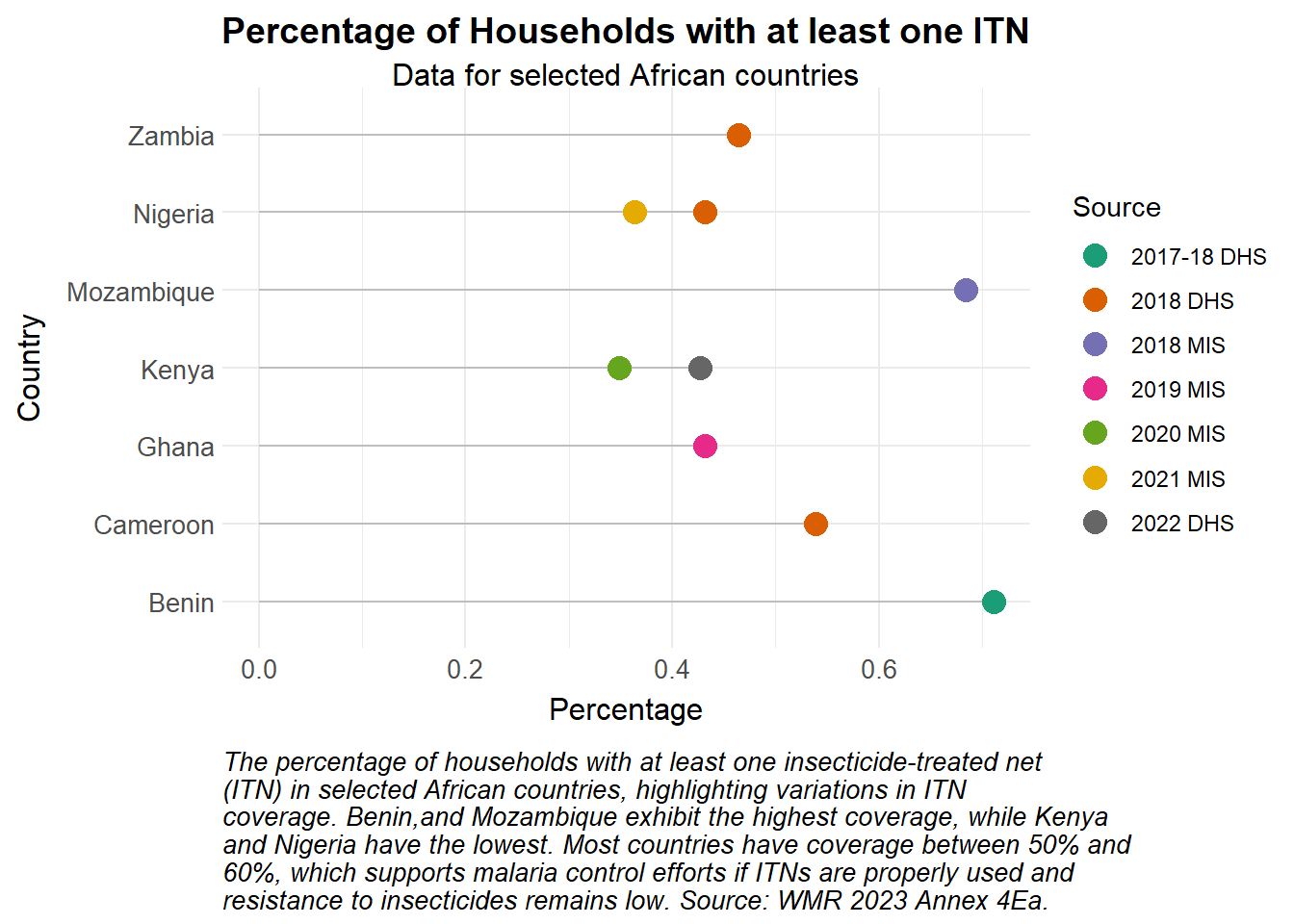
library(stringr)# Create the lollipop plotggplot(wmr2023Ea_Africa, aes(x =fct_reorder(Country, ITNCovPercent, .na_rm =FALSE),y = ITNCovPercent,color = Source)) +geom_segment(aes(x = Country, xend = Country, y =0, yend = ITNCovPercent), color ="grey") +# Keep constant grey color for segmentsgeom_point(size =4) +coord_flip() +# Adjust the aspect ratio to make the plot tallerscale_colour_manual_health_radar() +# Correct color scale for the discrete 'Source' variabletheme_health_radar() +labs(title ="Percentage of Households with at least one ITN",subtitle ="Data for selected African countries",caption =str_wrap("The percentage of households with at least one insecticide-treated net (ITN) in selected African countries, highlighting variations in ITN coverage. Benin,and Mozambique exhibit the highest coverage, while Kenya and Nigeria have the lowest. Most countries have coverage between 50% and 60%, which supports malaria control efforts if ITNs are properly used and resistance to insecticides remains low. Source: WMR 2023 Annex 4Ea.", width =75),x ="Country",y ="Percentage")
Show the code
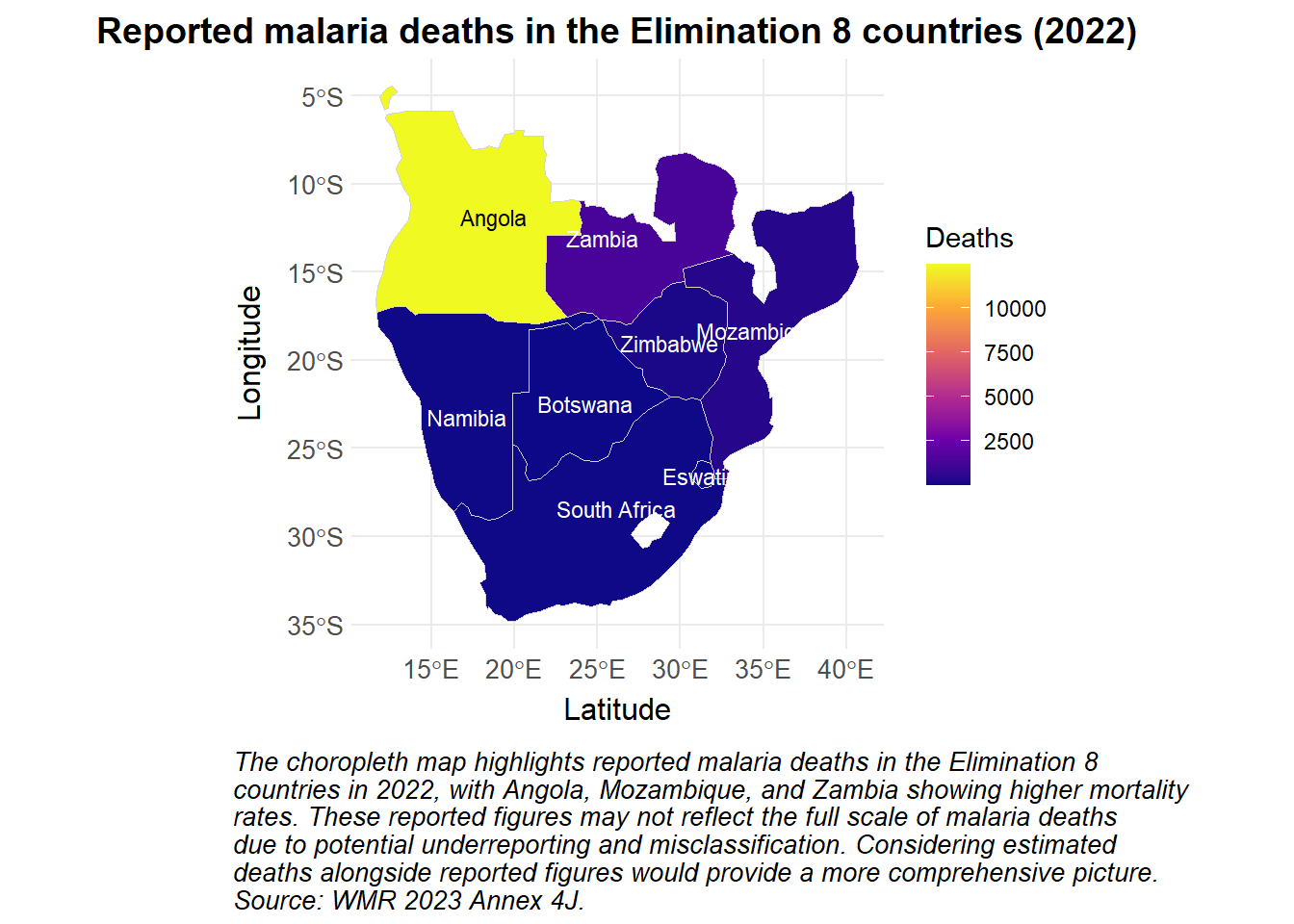
library(ggrepel)library(sf)library(rnaturalearth)library(rnaturalearthdata)library(whowmr)# Define the elimination 8 countriese8_countries <-c("Botswana", "Eswatini", "Namibia", "South Africa", "Angola", "Mozambique", "Zambia", "Zimbabwe")# Load the map data for Africae8_africa <-ne_countries(continent ="Africa", returnclass ="sf") |>mutate(name =if_else(name=="eSwatini", "Eswatini", name)) |>filter(name %in% e8_countries)# Merge the map data with your datae8_data <- e8_africa |>left_join(wmr2023$wmr2023j |>mutate(), by =c("name"="Country/area"))# Create the choropleth mapggplot(data = e8_data) +geom_sf(aes(fill =`2022`), color ="lightgrey", size =0.3) +# Use fill for the continuous 2022 datatheme_health_radar() +scale_fill_continuous_health_radar(name ="Deaths") +# Correct fill scale for continuous datalabs(title ="Reported malaria deaths in the Elimination 8 countries (2022)",caption =str_wrap("The choropleth map highlights reported malaria deaths in the Elimination 8 countries in 2022, with Angola, Mozambique, and Zambia showing higher mortality rates. These reported figures may not reflect the full scale of malaria deaths due to potential underreporting and misclassification. Considering estimated deaths alongside reported figures would provide a more comprehensive picture. Source: WMR 2023 Annex 4J.", width =80),x ="Latitude",y ="Longitude") +geom_sf_text(aes(label = name, color =ifelse(`2022`>mean(`2022`), "black", "white")), size =3) +# Conditional text colorscale_color_identity() +theme(plot.caption.position ="plot", # Keep the caption outside the plot area )
Show the code
whowmr::wmr2023$wmr2023f |># Filter for the frontline E8 countriesfilter(`Country/area`|> stringr::str_detect("Botswana|Eswatini|Namibia|South Africa"),# We couldn't get opt_interactive to work with grouped rows so we'll just display fewer columns Year>=2020) |># Rename columns to something more readablerename(Country="Country/area", `Population at risk`="Population denominator for incidence and mortality rate") |># Hide the footnotesmutate(Country=Country |> stringr::str_remove("\\d.*$")) |># Remove the WHO Region columnselect(!`WHO Region`) |>gt(groupname_col ="Country",row_group_as_column =TRUE ) |>tab_header(title="Population at risk and estimated malaria cases and deaths in the E8 frontline countries",subtitle="Data from WMR 2023 Annex 4F") |># Control how NA values are displayedsub_missing(columns =everything(), missing_text ="-") |># Group the Cases and Deaths columns and rename, eg, Cases_Lower to just Lowercols_label_with(columns =starts_with("Cases")|starts_with("Deaths"), fn=~stringr::str_remove_all(., ".+_")) |>tab_spanner(label="Cases", columns=starts_with("Cases")) |>tab_spanner(label="Deaths", columns=starts_with("Deaths")) |># Format the numbers to be more readablefmt_number(columns=c(`Population at risk`,starts_with("Cases")|starts_with("Deaths")), suffixing = T) |># Country column should be bold:tab_style(style =cell_text(weight ="bold"),locations =cells_row_groups() ) |>tab_style(style =cell_borders(sides =c("left"),weight =px(1)),locations =cells_body(columns =c(Year, `Population at risk`, Cases_Lower, Deaths_Lower) ) ) |>tab_style(style =cell_borders(sides =c("right"),weight =px(1)),locations =cells_body(columns =c(Deaths_Upper) ) )|>tab_options(table.align ="left")
Population at risk and estimated malaria cases and deaths in the E8 frontline countries
Data from WMR 2023 Annex 4F
Year
Population at risk
Cases
Deaths
Lower
Point
Upper
Lower
Point
Upper
Botswana
2020
1.69M
1.20K
1.76K
2.70K
-
11.00
-
2021
1.72M
820.00
1.06K
1.50K
-
5.00
-
2022
1.74M
420.00
542.00
740.00
-
6.00
-
Eswatini
2020
330.58K
-
233.00
-
-
2.00
-
2021
333.83K
-
505.00
-
-
5.00
-
2022
336.47K
-
214.00
-
-
4.00
-
Namibia
2020
1.98M
16.00K
20.19K
25.00K
-
35.00
-
2021
2.01M
17.00K
21.32K
26.00K
-
14.00
-
2022
2.04M
13.00K
16.89K
21.00K
-
28.00
-
South Africa
2020
5.88M
-
4.46K
-
-
38.00
-
2021
5.94M
-
2.97K
-
-
56.00
-
2022
5.99M
-
2.04K
-
-
29.00
-
Show the code
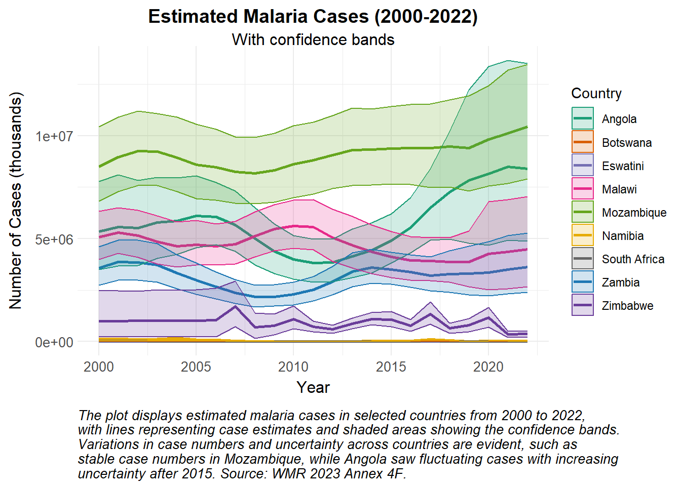
# Create the plot for Deaths with low and high bandswhowmr::wmr2023$wmr2023f |># Filter for the E8 countriesfilter(`Country/area`|> stringr::str_detect("Angola|Botswana|Eswatini|Malawi|Mozambique|Namibia|South Africa|Zambia|Zimbabwe")) |># Rename columns to something more readablerename(Country="Country/area", `Population at risk`="Population denominator for incidence and mortality rate") |># Hide the footnotesmutate(Country=Country |> stringr::str_remove("\\d.*$")) |># Remove the WHO Region columnselect(!`WHO Region`) |>ggplot(aes(x = Year, y = Cases_Point, group = Country, color = Country)) +geom_line(linewidth =1) +geom_ribbon(aes(ymin = Cases_Lower, ymax = Cases_Upper, fill = Country), alpha =0.2) +# Corrected to use 'fill' for the ribbonscale_colour_manual_health_radar() +# Apply manual color scale for 'color' aesthetic (lines)scale_fill_manual_health_radar() +# Apply manual color scale for 'fill' aesthetic (ribbon fill)theme_health_radar() +labs(title ="Estimated Malaria Cases (2000-2022)",subtitle ="With confidence bands",x ="Year",y ="Number of Cases (thousands)",color ="Country",fill ="Country", # Added 'fill' label for the ribbon shadingcaption =str_wrap("The plot displays estimated malaria cases in selected countries from 2000 to 2022, with lines representing case estimates and shaded areas showing the confidence bands. Variations in case numbers and uncertainty across countries are evident, such as stable case numbers in Mozambique, while Angola saw fluctuating cases with increasing uncertainty after 2015. Source: WMR 2023 Annex 4F.", width =85) )
Show the code
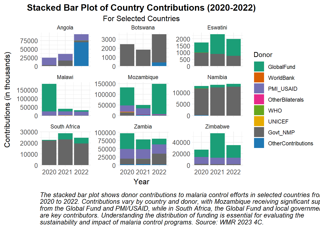
# Read in the costing datacosting_df <-read_csv("tutorial_data/costing_df.csv")# Reshape data for plottingplot_df <- costing_df |>pivot_longer(cols =starts_with("Country_"), names_to ="Donor", values_to ="Amount") |>mutate(Donor =gsub("Country_", "", Donor)) # Remove "Country_" from the Donor names# Set the order of the donors so that "Govt_NMP" is lastplot_df$Donor <-factor(plot_df$Donor, levels =c("GlobalFund", "WorldBank", "PMI_USAID", "OtherBilaterals", "WHO", "UNICEF","Govt_NMP", "OtherContributions"))# Create the plotggplot(plot_df, aes(x = Year, y = Amount /1000, fill = Donor)) +geom_bar(stat ="identity", position ="stack") +facet_wrap(~ Country, scales ="free_y") +scale_fill_manual_health_radar() +# Apply the custom fill scale for 'Donor'labs(title ="Stacked Bar Plot of Country Contributions (2020-2022)",subtitle ="For Selected Countries",x ="Year",y ="Contributions (in thousands)",fill ="Donor",caption =str_wrap("The stacked bar plot shows donor contributions to malaria control efforts in selected countries from 2020 to 2022. Contributions vary by country and donor, with Mozambique receiving significant support from the Global Fund and PMI/USAID, while in South Africa, the Global Fund and local government are key contributors. Understanding the distribution of funding is essential for evaluating the sustainability and impact of malaria control programs. Source: WMR 2023 4C.", width =100) ) +theme_health_radar() # Apply the custom radar theme
How can this data be used in disease modelling?
Preparing the data
We obtain estimated case data (Annex 4-F) from Angola for the years 2000 to 2022. For high transmission countries in the WHO African Region, estimates are derived from a spatiotemporal Bayesian geostatistical model, using parasite prevalence data from household surveys. This methodology is further described in Annex 1 of the World Malaria Report.
We can use this data to calibrate our disease models, by fitting model outputs to estimated malaria cases from the World Malaria Report. Throughout the calibration process we adjust the initial parameters we input into the model, making the model more accurate and representative of actual disease dynamics in a specific context. These parameters represent specific dynamics occurring the in the modelled context, for instance ITN usage (\(itn_{use}\)) may be really high in Angola, or the dominant Anopheles vector in this region may have a higher human biting rate (\(a\)) than other Anopheles species. Country-specific parameter values should be obtained from existing datasets such as DHS surveys, literature review, expert knowledge, and published reports from national control programs and other stakeholders. This data carries a level of uncertainty that may prevent the model from making accurate projections, but this can be accounted for in uncertainty and sensitivity analyses to increase the model results’ credibility and robustness.
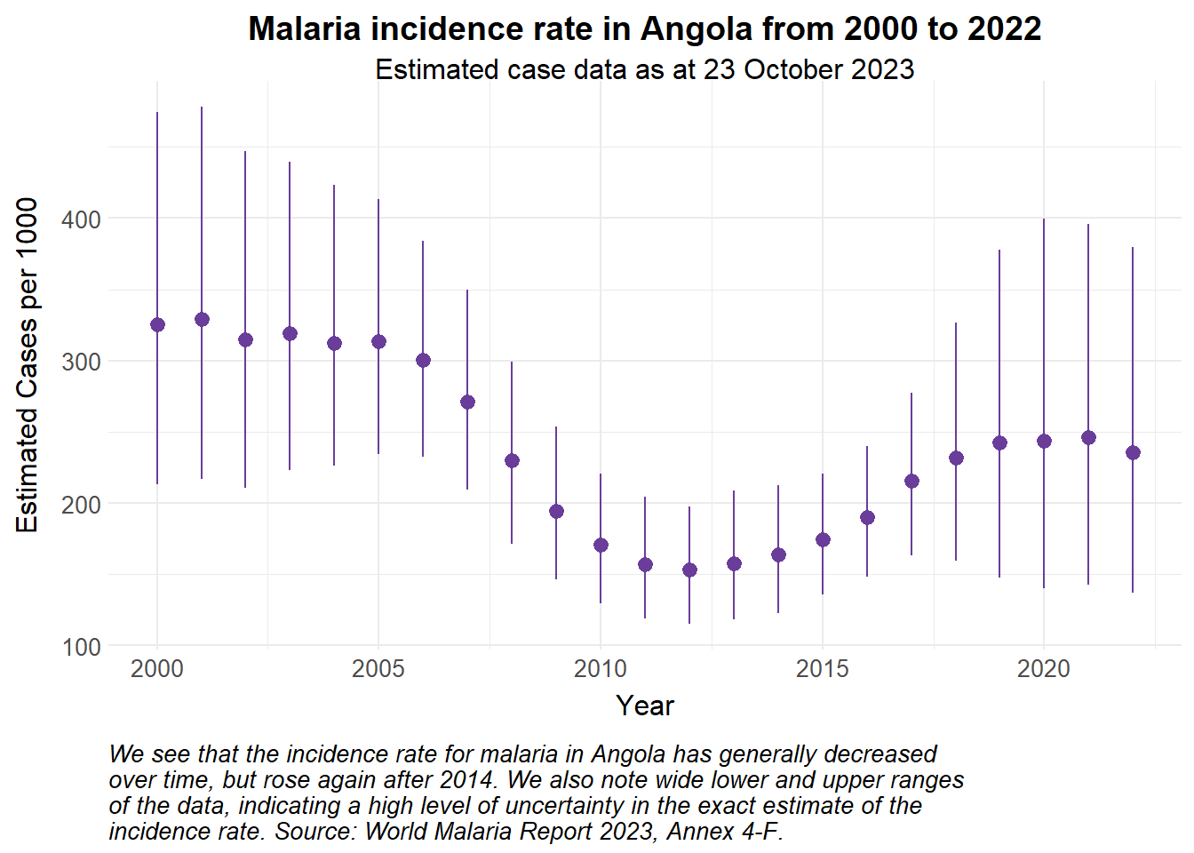
For this example, we fit a simple malaria model to incidence rates calculated from estimated case data from Angola. While it is simpler to fit to case numbers, fitting to incidence rates allows us to capture the disease burden relative to a changing population size, and is better for comparing burden across different populations. Here, we calculate incidence rate per 1000 of the population at risk with the following formula: \[ \textrm{Incidence rate} = \frac{\textrm {Estimated Cases}}{\textrm {Population at risk}} \times 1000 \]
Show the code
estimated_data <- whowmr::wmr2023$wmr2023f |># Filter for Angolafilter(`Country/area`=="Angola") |>rename(Population_at_risk ="Population denominator for incidence and mortality rate") |>select(Year, Cases_Lower, Cases_Point, Cases_Upper, Population_at_risk) |># Calculate the incidence ratemutate(inci_rate = Cases_Point/Population_at_risk*1000,inci_rate_lower = Cases_Lower/Population_at_risk*1000,inci_rate_upper = Cases_Upper/Population_at_risk*1000) estimated_data |>ggplot() +#geom_pointrange(aes(x = Year, y = Cases_Point, ymin = Cases_Lower, ymax = Cases_Upper), colour = theme_health_radar_colours[15]) + # to see case numbersgeom_pointrange(aes(x = Year, y = inci_rate, ymin = inci_rate_lower, ymax = inci_rate_upper), colour = theme_health_radar_colours[9]) +labs(title ="Malaria incidence rate in Angola from 2000 to 2022",subtitle ="Estimated case data as at 23 October 2023",y ="Estimated Cases per 1000",caption = stringr::str_wrap("We see that the incidence rate for malaria in Angola has generally decreased over time, but rose again after 2014. We also note wide lower and upper ranges of the data, indicating a high level of uncertainty in the exact estimate of the incidence rate. Source: World Malaria Report 2023, Annex 4-F.")) +theme_health_radar()
Model assumptions
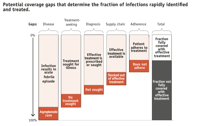
We assume that the vector population is at equilibrium, and that ITNs are a widely-used control intervention in Angola. For more details on how to incorporate ITNs and calculating effective coverage, see the DHS page. In a more complex model, we would also account for other Angola-specific interventions, such as larviciding, as well as the treatment cascade illustrated below.
Source: WHO (2014). From malaria control to malaria elimination: a manual for elimination scenario planning.
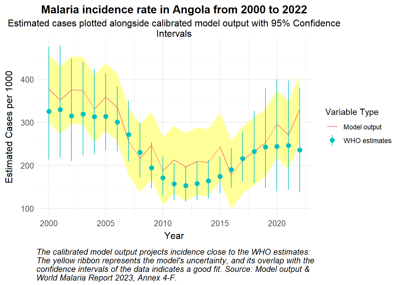
Simulated calibration
Following calibration and fine-tuning of the parameters, we anticipate model outputs that mimic the pattern and overall trajectory of the estimated data. We simulate an example below:
Show the code
# Simulated model output with 95% Confidence intervals of incidence ratesmodelled_incidence_rate <-data.frame(Year =2000:2022,incidence_rate = estimated_data$inci_rate +rnorm(length(estimated_data$inci_rate), mean =30, sd =25)) |>mutate(std_error =0.04, # for examplelower_bound = incidence_rate - (1.96* std_error *1000),upper_bound = incidence_rate + (1.96* std_error *1000),Type ="Model output")ggplot() +geom_ribbon(data = modelled_incidence_rate, aes(x = Year, y = incidence_rate, ymin = lower_bound, ymax = upper_bound), fill = theme_health_radar_colours[20]) +geom_line(data = modelled_incidence_rate, aes(x = Year, y = incidence_rate, colour = Type)) +geom_pointrange(data = estimated_data |>mutate(Type ="WHO estimates"), aes(x = Year, y = inci_rate, ymin = inci_rate_lower, ymax = inci_rate_upper, colour = Type)) +labs(title ="Malaria incidence rate in Angola from 2000 to 2022",subtitle = stringr::str_wrap("Estimated cases plotted alongside calibrated model output with 95% Confidence Intervals"),y ="Estimated Cases per 1000",colour ="Variable Type", caption = stringr::str_wrap("The calibrated model output projects incidence close to the WHO estimates. The yellow ribbon represents the model's uncertainty, and its overlap with the confidence intervals of the data indicates a good fit. Source: Model output & World Malaria Report 2023, Annex 4-F.")) +theme_health_radar()
The next steps are to validate the model, ensuring that it continues to replicate data outside of the calibration period. A sensitivity analysis would help identify which parameters have the most influence on model outputs, and quantify the level of uncertainty in the parameters, further strengthening the reliability of the model for projections going forward.
Policy implications
Calibrated models that produce outputs aligned with real-world incidence or prevalence data are relevant and credible. This increases confidence and utility for decision makers in planning for malaria programming. In addition, models that are tailored to a specific context can better answer questions regarding the impact of certain interventions, or the implementation of other policies in the specified area.